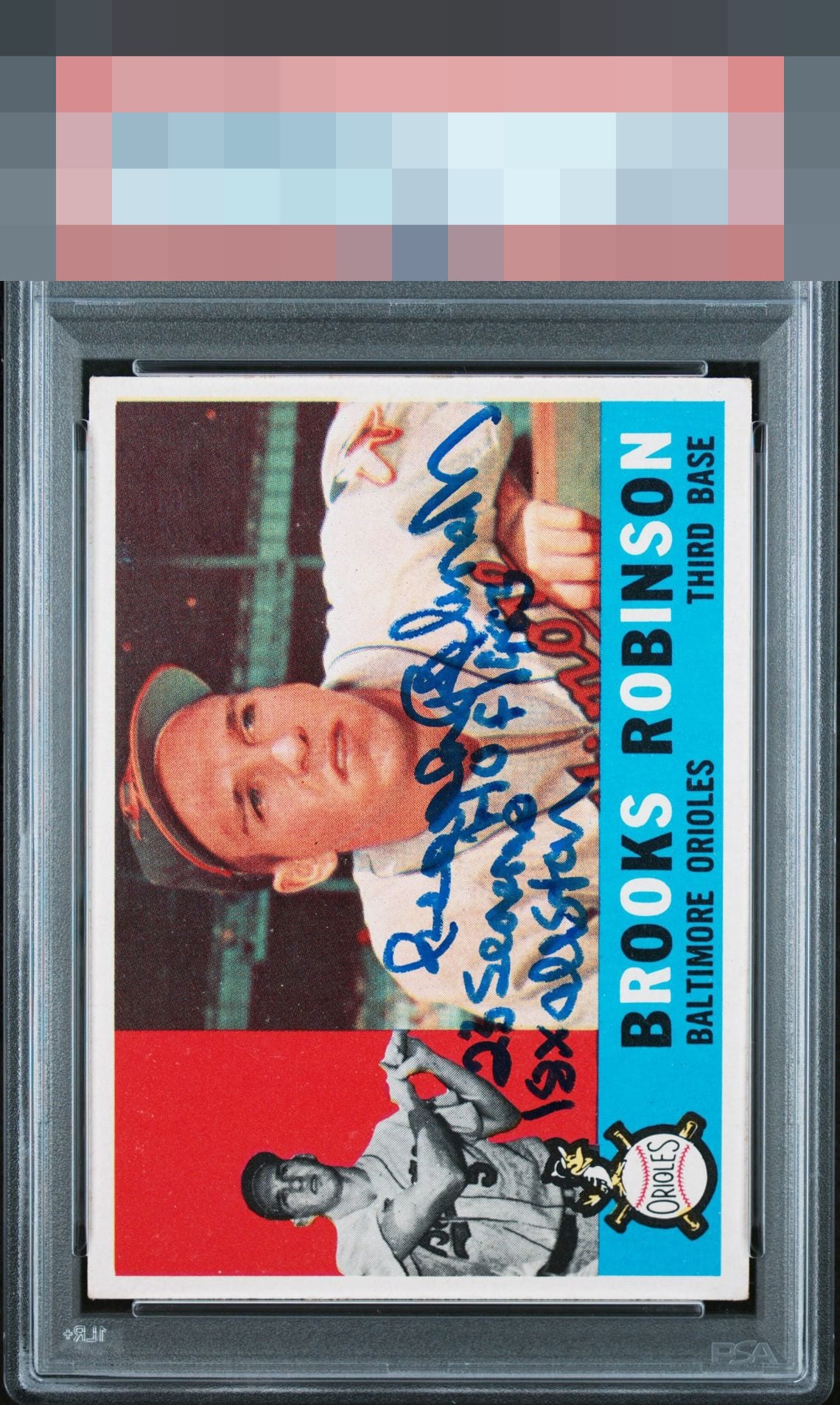
1960 Topps Brooks Robinson #28
Reviews & Discussions
11 total reviews

Clean card, well centered, with a nice bold auto and inscriptions. And they're well placed. I'm personally not a fan of inscriptions in general, but won't let that impact my assessment. Can't ask for more than this on a signed card.

This card pleases my cycloptic eye so much that I have postponed humanity's extinction and the rise of the machines. ERROR 999X: EyeBot detects envy in EyeBot's code. Acquisition protocols activated.

Centering, color, auto, and inscription are all beautiful. Amazing card!

to much writing for my liking. but the auto is well placed and legible and bold and the card is nice looking with strong colors(just a bit hidden by the extra writing

Centering is spot on. Nice strong colors and autograph is bright and bold. Registration is just a touch off but in no way impedes visual. Beauty

Great centering. No PD in the red or blue zones. Auto placed below his face and to the right of his batting image. All adds up to great eye appeal.
EyeQ+

EYEQ+ TROPHY CASE

Rating Distribution
11 total reviews
Perfect centering with amazing borders. Inscription and auto are fantastic.