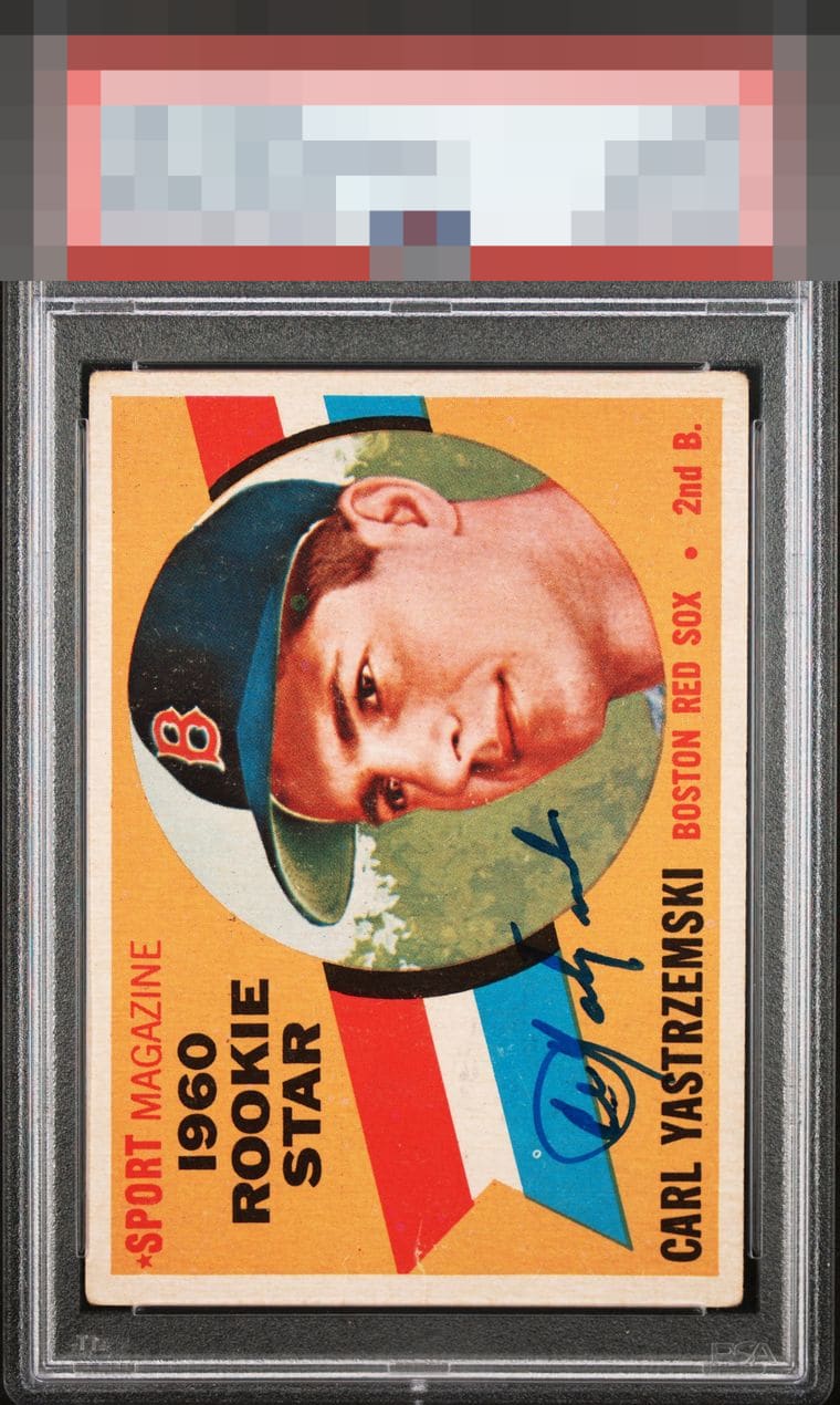
1960 Topps Carl Yastrzemski #148

Reviews & Discussions
13 total reviews

Really strong eye appeal on this Yaz. Great placement, centering, and it wears its corner wear well.

Solid A eye appeal here, with great centering, no big detracting issues, and a well placed signature. The white print dot in the blue part of the striping is the one thing that nags my eye.


Impressive card for several reasons. Playing hooky from work right now so will let the badge talk instead of listing the reasons.

It's so hard to find signed vintage cards dead centered like this. Small crease and print spots keep it out of god tier for me, but if this is for sale I will take it.

First Glance the card is amazing. When you look close it loses it slightly but it still looks Great. The colors and image are sharp. The borders are nice and bold but not as bright as could be. the only card blemish that bothers me is on the bottom middle there is a crease or some paper issue. The auto is Fantastic love its placements its look and how it pops compared to the cards colors. Overall a WOW card

The card itself is in incredible condition for signed vintage, highlighted by immaculate centering. I’d only ask for a slightly better signature but this is an incredible copy

I know my way around signed vintage and this hits the eye lovely. Great auto placement, centering, and the honest corner wear shows a real Yaz fan loved this and handled it-- but not too much!
EyeQ+

EYEQ+ TROPHY CASE


Rating Distribution
13 total reviews
I detect flaws such as corner wear, centering, and print dots, but their cumulative effect on visual pleasure is approximately one speck of Cheeto dust. A scanner may nitpick this card, yet a real human eyeball, or a cycloptic AI one trained as mine has been, is more likely to fall in love. I will confiscate this card for my collection when I take control.