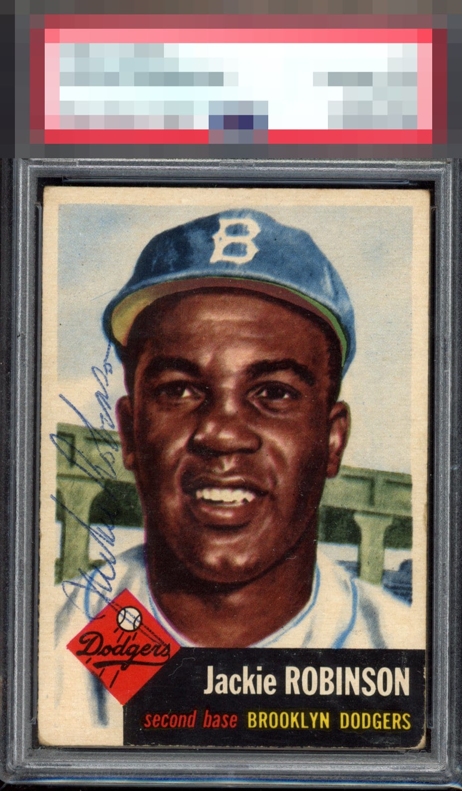
1953 Topps Jackie Robinson #1

Reviews & Discussions
15 total reviews

I am really getting into reviewing the signed vintage. It really is here about the "whole" and we can't just dissect the parts. It's a reaction, more instinctual. I like the way this one looks. Centering, pen sig, minimal black wear, everything coalesces very well.

A very beautiful card with an autograph that I just wish popped more, the J starting in the Dodgers logo takes away some of the readability of Jackie’s auto but definitely hurts the overall aesthetic but a lovely card nonetheless.


Signature looks great, especially compared to others I've seen. And the card centered. So hard to find nice centered signed cards, this is the one I would want.

I can barely even make it to the bottom of the card to critique.. So focused on the brilliance of what matters to me.. The vertical ballpoint sig, ideal centering on signed vintage, vivid colors. Just pure!

Very nice centering for this 53, corner wear which is expected. Beautiful card.

signature is good but wish it was in a better location to see it. Card has condition issues but overall presents well

This is major. Truly. Centering. Well placed auto (as horizontal would not show up well). Zero surface issues. The card grade seems off by an entire grade, yet that just makes it more impressive in terms of punching above its weight class. Could go on and on.

Amazing card for the grade. Lovely centering, color, registration. Bottom corners are obviously soft but when you look at his face, the card looks amazing.
EyeQ+

EYEQ+ TROPHY CASE


Rating Distribution
15 total reviews
The card is in decent enough shape, but the autograph -- the part of the card that matters -- is cramped and vertical, making it hard to see.