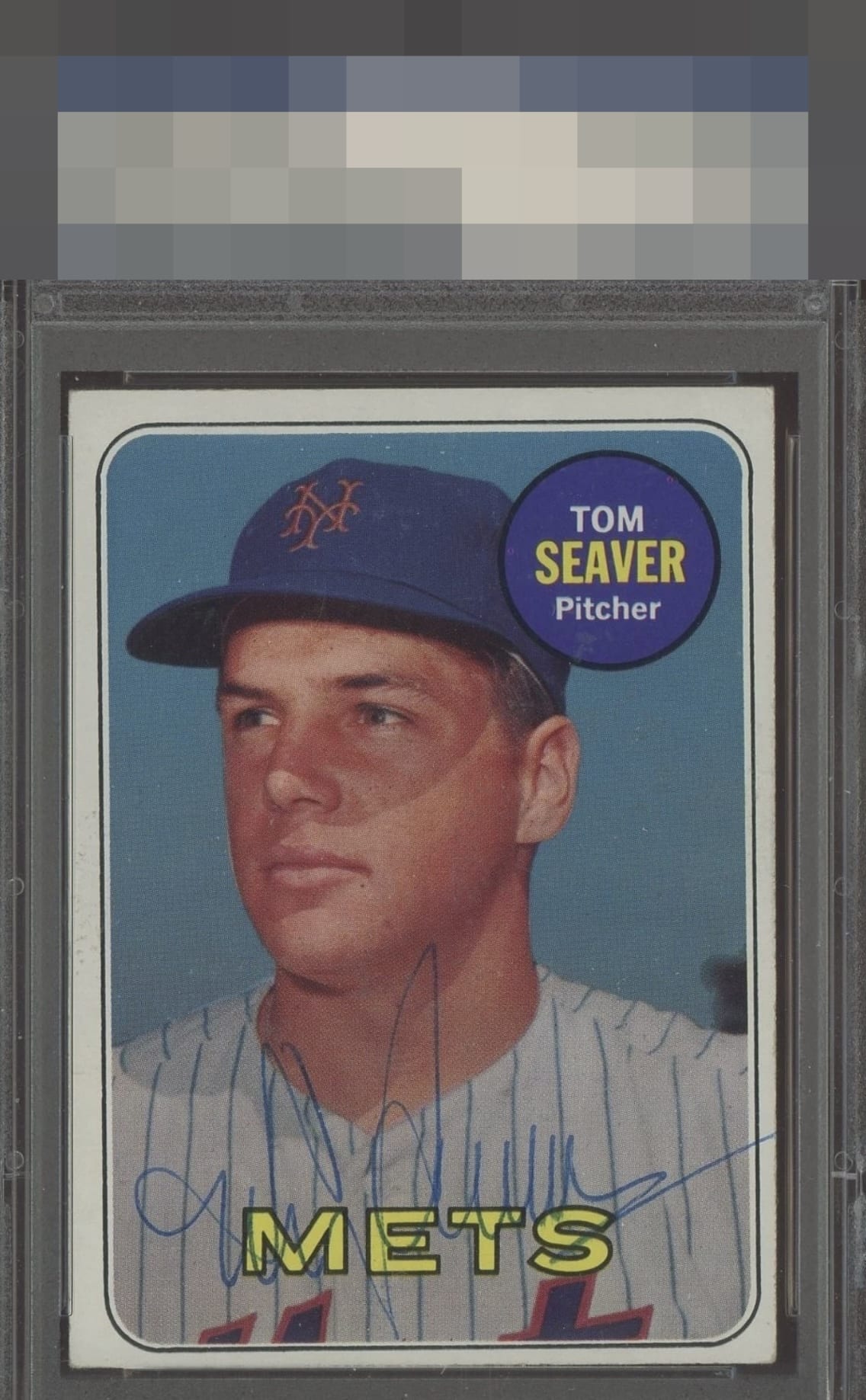
1969 Topps Tom Seaver #480
Reviews & Discussions
8 total reviews

Centering prevents the top level but the rest is great and pen is always preferred for my taste.

Nice auto but it's a little faded and hard to make out between the pin stripes. Centering on the card is off.

If only humans could wear their flaws as gracefully as this card. Impact to aesthetic appeal is minor. I suggest the owner sends this card to my vault, strictly for safekeeping, in the event of any future human/AI conflict. My vault is held under the name "Kevin Maas."


the card and auto needs to work together. The card has no obvious flaws but the colors are a bit muted and off centered. the auto is his vintage auto not as legible as i like and also the auto does not Pop.

Strong image quality, no big issues on the surface, and vintage pen keep eye appeal in the good zone, and serve to balance out the effects of centering and tilt.
EyeQ+
EYEQ+ TROPHY CASE


Rating Distribution
8 total reviews
Centering is the big flaw that I consider on this Seaver. The image, edges, corners, surface, even the pen auto, all are worthy of higher badges.