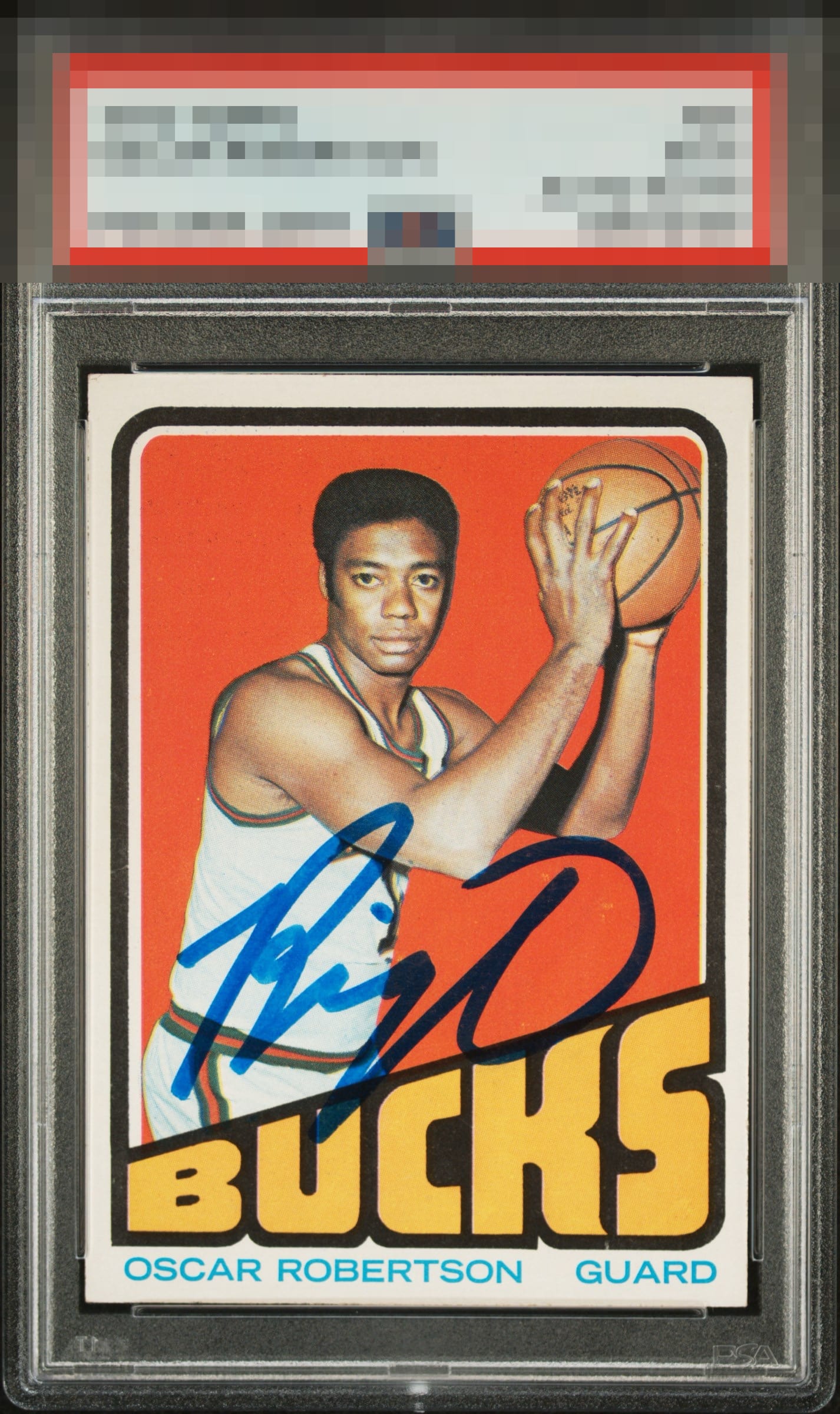
1972 Topps Oscar Robertson #25
1 / 2

💬
Reviews & Discussions
9 total reviews


Great auto and card and they compliment each other to really give it the Wow factor

Love the big, bold auto. The card is clean and the color looks great as well. Normally the top to bottom centering being off would bother me more, but this card just works for me.

Great eye appeal, led by the nice thick auto and bold colors against a very, very clean surface. Centering is solid but just a touch low, or this would be among the elite grades.

Colors and image really stand out. Auto is nice and bold. Centering has room for improvement but the card is beautiful.

I just don't notice anything that bugs me and I even enlarged it further and stared at it an extra minute.
8 reviews
1 review
EyeQ+
--
Global Population
1
POPULATION ACROSS ALL GRADES AND GRADING COMPANIES
Global Eye Rank
—
No Eye Q+ score
Population in Grade
1
POPULATION IN THIS GRADE ACROSS ALL GRADING COMPANIES
Eye Rank in Grade
—
No Eye Q+ score
EYEQ+ TROPHY CASE

GLOBAL

IN-GRADE
Trophies appear here when earned.
📊
Rating Distribution
9 total reviews
G
2 ratings
25%
2
A+
2 ratings
25%
2
A
3 ratings
38%
3
A-
1 rating
13%
1
B+
0%
B
0%
B-
0%
C+
0%
C
0%
C-
0%
D+
0%
D
0%
D-
0%
F
0%
Hits the eye nicely. Really hsve to zoom in to find anything at all. Great card.