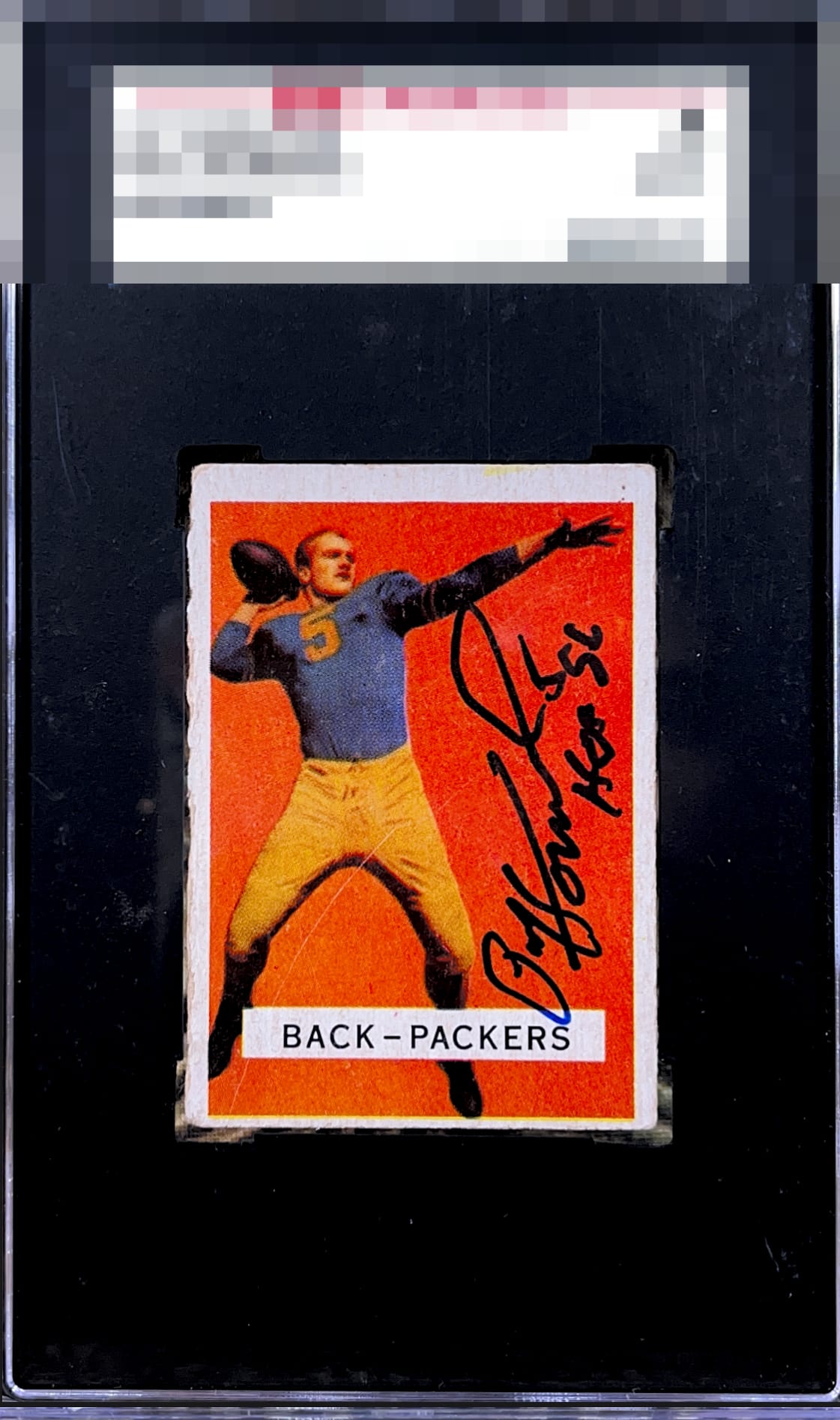
1957 Topps Paul Hornung #151
1 / 2
Click to enlarge

💬
Reviews & Discussions
7 total reviews

I'm going with rather high eye appeal here, even in the face of one prominent scratch or line and off-centering. The image is very cool to me and I love how the black ink pops off the background color.

There is a vertical line thru the part of the player is what I see first than the borders clean and bright but off center. Then the auto is nice and bold and well placed but not a clean autograph.

Very nice color and bold auto. Off-centered and the left edge has too much wear.
4 of 7 reviews
3 reviews
EyeQ+
--
Not eligible for AUTH cards
Global Population
1
POPULATION ACROSS ALL GRADES AND GRADING COMPANIES
Global Eye Rank
—
Not eligible for AUTH cards
Population in Grade
1
POPULATION IN THIS GRADE ACROSS ALL GRADING COMPANIES
Eye Rank in Grade
—
Not eligible for AUTH cards
EYEQ+ TROPHY CASE

GLOBAL

IN-GRADE
EyeQ+ scores are not available for AUTH cards.
📊
Rating Distribution
7 total reviews
G
0%
A+
0%
A
0%
A-
0%
B+
1 rating
25%
1
B
0%
B-
2 ratings
50%
2
C+
1 rating
25%
1
C
0%
C-
0%
D+
0%
D
0%
D-
0%
F
0%
Beautiful bold print colors, clean white borders, and a clean crisp and well-placed auto from Hornung. Centering, edge wear and potentially some surface issues hold it back though some of that may be on the slab. Overall a nice, presentable auto card!