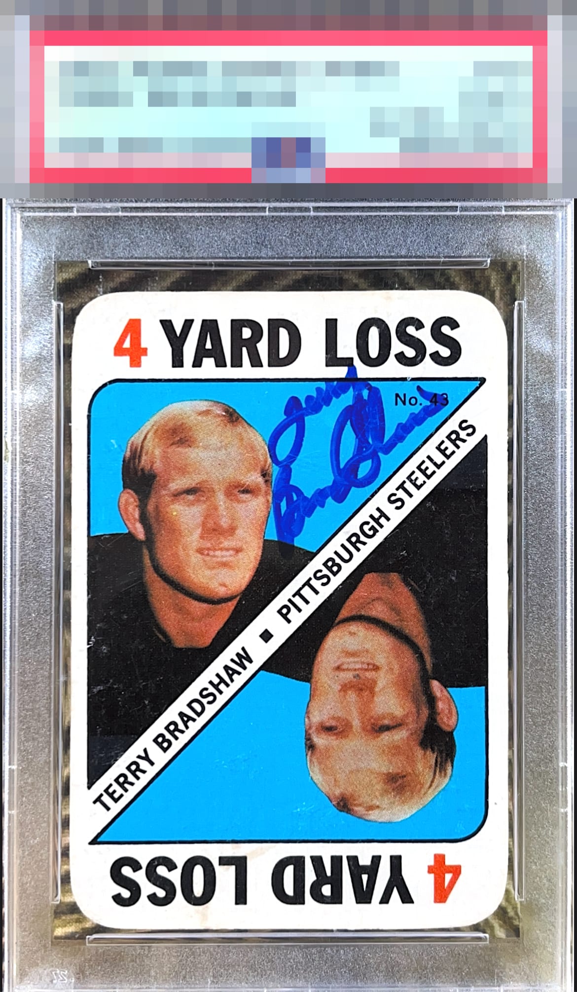
1971 Topps Terry Bradshaw #43

Reviews & Discussions
11 total reviews

Terry was backed up against the goal line in terms of the real estate he had to work with on this card, and really got the ball in there! Solid eye appeal.

A fun auto here - centering and surface are the main callouts that hold it to B-tier

I may be alone on this thinking, but when a player clearly goes out of his way to place the auto in a unique spot to avoid his face I just smile. Great job Terry.


Minor surface issues and a centering opportunity are my main notes. Nice card/auto combo.

The auto is bold but a little tough to make out. Looks like he did his best to fit it in a small space. Nice color on the card but there are some surface issues.

Love the colors on this card and the bold, well-placed auto overcomes the snow that shows up so readily on the black areas. Attractive piece.

It is a nice card and a nice autograph but neither elevates the overall look of the card. The autograph is nice and bold but it is smushed into a small space and is not present well. The card is clean and bright and has nice colors but it off center. Still A card I would have and enjoy just wishing it could have been more

EyeQ+
EYEQ+ TROPHY CASE


Rating Distribution
11 total reviews
My sensor is pleased by this Bradshaw, and I am impressed by the precision of his hand.