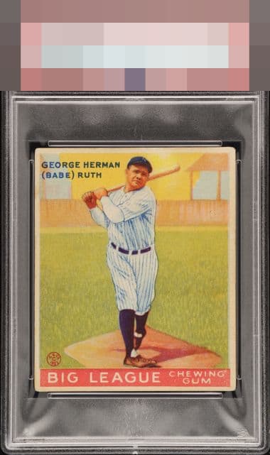
1933 Goudey Babe Ruth #144

Reviews & Discussions
17 total reviews

Wildly nice 1.. The delta between grade and eye appeal cannot be understated here.

Great copy for the grade. Slight centering shift left holds it back.

One of the joys of this hobby is to own a card that sits in a "1" holder but has tremendous eye appeal--and this card certainly qualifies!

Off centered a bit left to right and evenly rounded corners are the obvious issues, but this card presents incredibly well for the low technical grade. Very handsome example.

Centering has a little room for improvement. An overall solid card.


OPS+ similar to the Babe here. I can't tell if its the scan or the card, but it looks a little fuzzy up close. Still, that's what you hunt auction catalogs for hours for.

Eye Appeal is all about how the card simply hits your eye-- both in that all-important first impression, and after staring at it a little bit. This card's great first impression lasts as you look at it, and no flaws emerge that distract. Then one cannot help note it was determined by the traditional criteria to be "the worst" condition a card can be in-- which certainly strains commons sense. Great looking card, and noteworthy looks for a '1.'

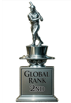
EyeQ+
EYEQ+ TROPHY CASE

Rating Distribution
17 total reviews
Good centering, registration. Strong eye appeal for the grade.