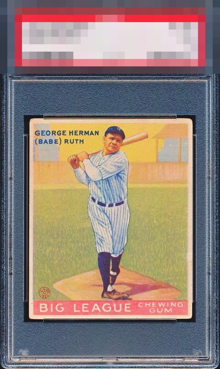
1933 Goudey Babe Ruth #144

Reviews & Discussions
12 total reviews

this turns my bambi-no into a bambi-yes. oh, the door is that way? ok ill see myself out.

This card is often super blurry but this one has good focus. Well framed with even corners, just a touch light on color. Strong example.

A tale of two cards: really well-centered but also really faded and dull colors.

This is really close for me. Well centered and the presentation is quite nice. Just looks a little faded to me or this would be a solid A.

Centering, check. Focus, check. Surface, check. The corner wear is noticeable, but it does not in any way spoil the party.

I am dying to see what grade this is. Square up the corners and this is GT. The clarity on his facial features is such an elusive trait on the 144, then add centering like this AND no wrinkles and we have a special card on our hands.

Centering looks amazing, a little out of focus and the color has faded some, but overall a very nice example.

the borders and centering on this card are better than most of the #144 Ruths. The image and the colors are good and clean but they do not POP Overall I nice card for many collectors collections

For this card, I’d want to see strong and bright colors but this example is too faded unfortunately. That said, the centering is better than average and the corner wear is uniform so it doesn’t distract.
EyeQ+
EYEQ+ TROPHY CASE

Rating Distribution
12 total reviews
Great card, colors and registration with appropriately vintage-y corners.