1962 Topps Bob Clemente #10
Reviews & Discussions
10 total reviews

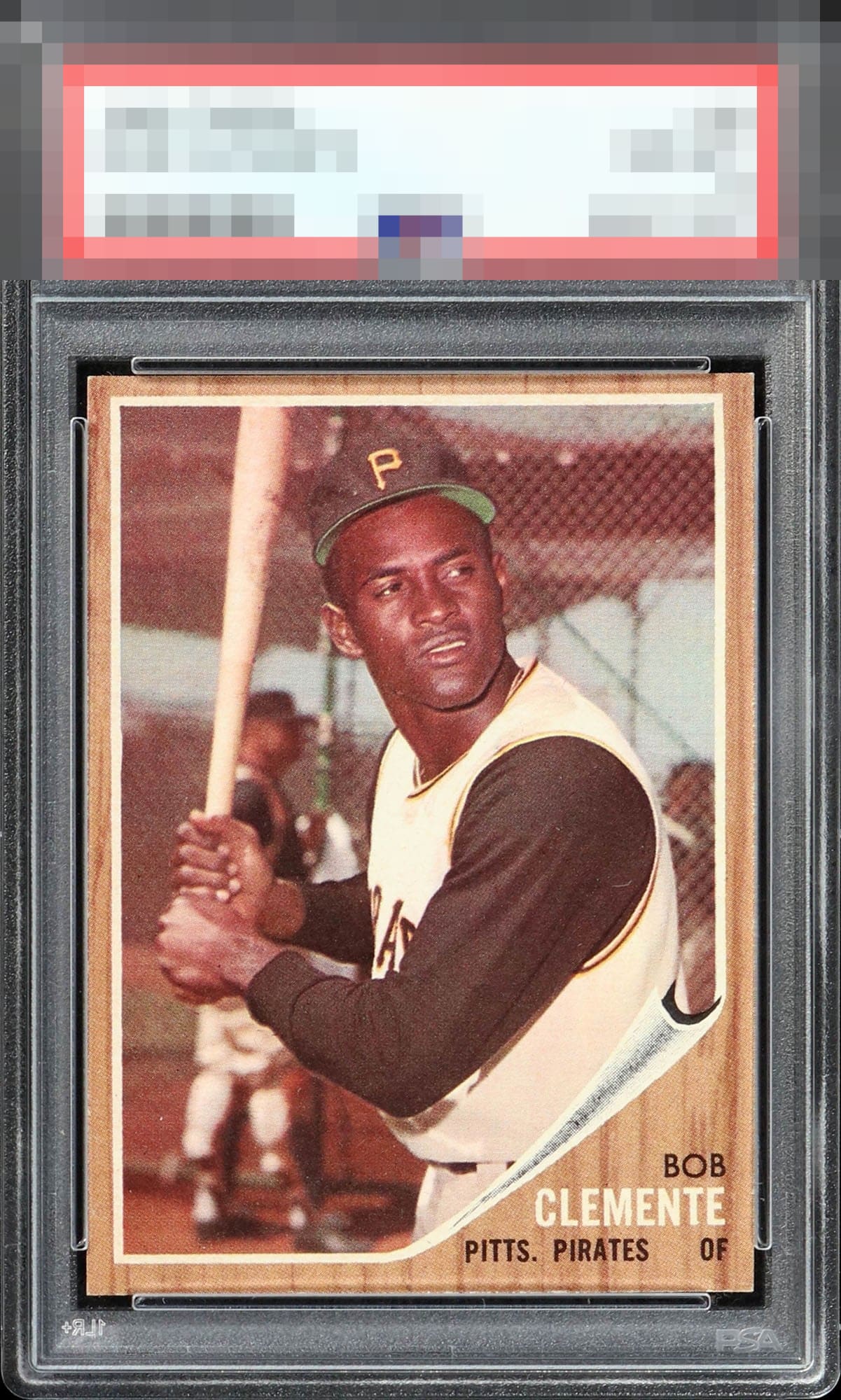
Incredible centering, colors, and almost no corner or edge wear visible to the naked eye. The aging of the paper make it look like its actually made of oak. Looks like a near perfect example of this classic card.

Edges, corners, image…all at the apex of eye appeal. Only a slight shift in centering to note. Elite.

Outside of the border sizes not matching and the card having centering opportunities it is easy to enjoy. AND to me the borders in this card is not as noticeable due to the way the inner borders of the card flow

Image is nice and clear, surface is clean, and I see no signs of typical edge and corner wear for this issue. Slight centering shift away from god tier.


A touch of centering keeps this from God Tier for me. I'd have to hold it too close to my eye to care about those corners, in real life viewing.

I suppose my main gripe is this card looks so damn good it's likely high grade and I could not afford it, LOL! The eye appeal announces itself immediately and does not diminish with a longer look. A touch of centering affects most; the corner wear at that level is, to me, a shrug.
EyeQ+
EYEQ+ TROPHY CASE


Rating Distribution
10 total reviews
Rock solid "A" to my eye. The flaws are nominal, a touch off centered to the left impacts but the barely noted corner wear I ignore. Beautiful card that would be very hard to upgrade in the looks department.