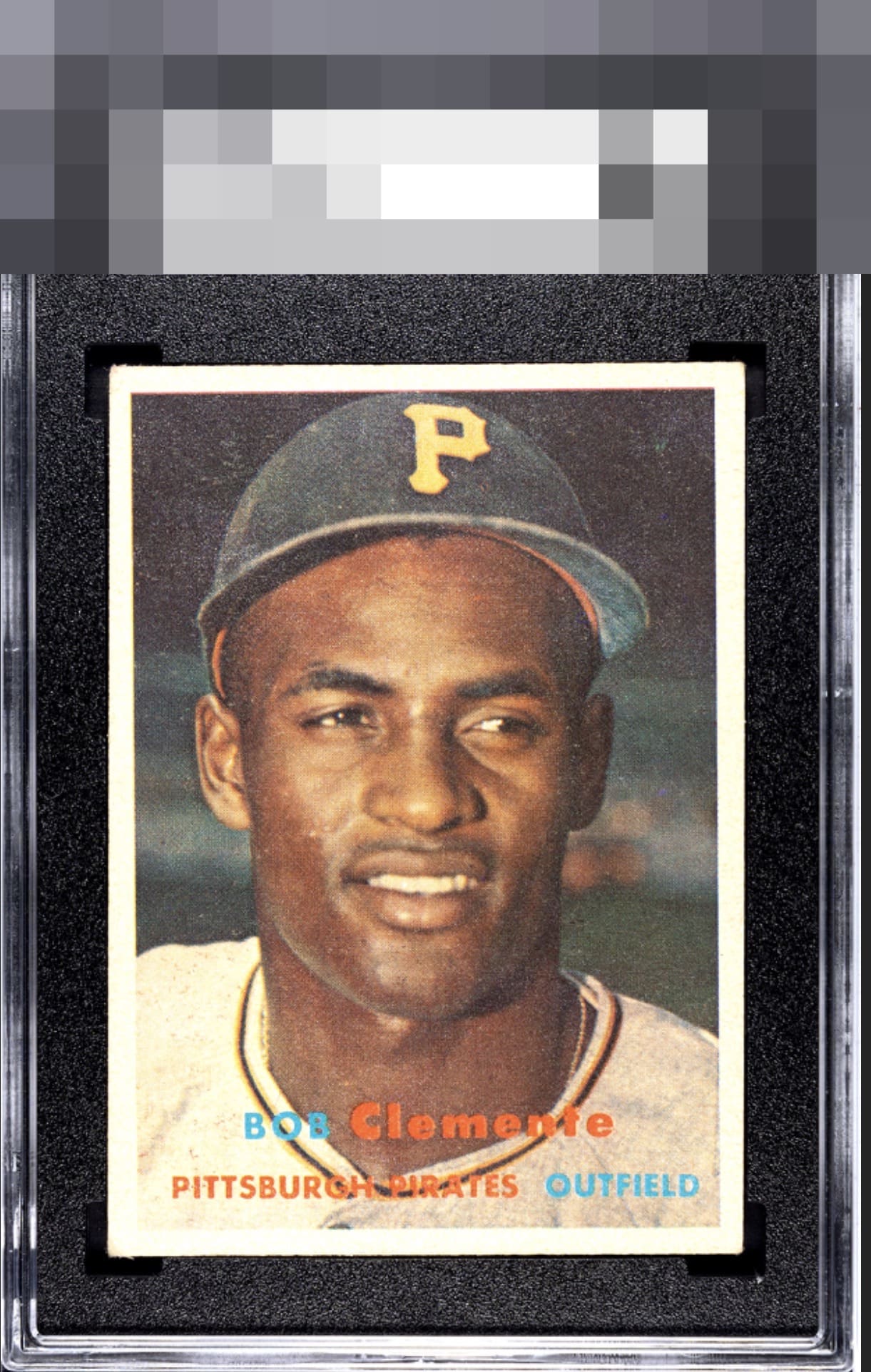
1957 Topps Bob Clemente #76

Reviews & Discussions
8 total reviews

Yes it’s OC with some tilt - but this 57 Clemente is nice for a tough card in a notoriously tough set. Beautiful print, color with just a smidge of wear, clean white borders explain the quality and clarity of the image and color. This one’s better than most - top end of B tier for me, OC keeps it out of A

Slight centering shift and a little scratchy print but nice corners and the card retains its overall appearance and has very nice eye appeal.

Probably looks better from a little farther away but there appears to be quite a bit of snow or surface wear. The borders are bright white but there is a noticeable centering tilt and some minor corner wear as well.

card i would be proud to own but understand the limitations of the surface wear and the tilt of the borders effecting how well it frames the card

A very high B with tilt that precludes the lofty B+. Good eye appeal driven by a clean image with no loud distractions therein.

EyeQ+
EYEQ+ TROPHY CASE


Rating Distribution
8 total reviews
The centering tilt is a bit distracting and there seem to be some print imperfections on the upper portion. I do like the snow white borders and colors.