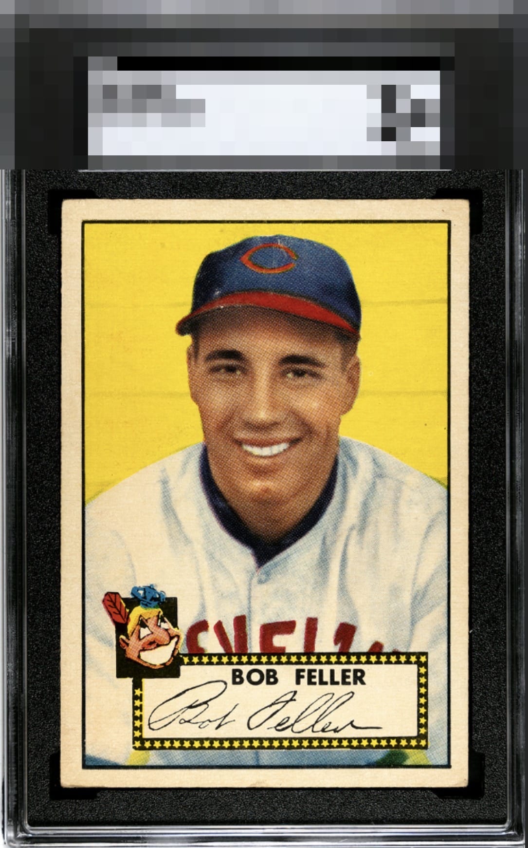
1952 Topps Bob Feller #88

Reviews & Discussions
11 total reviews

Presents well with a beautiful, vibrant color pop. OC and some surface blems/wear hold it to B tier.


A great looking '52 Feller. Strong corners with some slight softness. Centering is just a smidge off and the surface has some wear.

Centering for my eye barely hits the strike zone. Obvious wear in the cap area along with even corner wear lands this card just outside the A tier.

EyeBot detects strong visual appeal anchored by centering that is nearly even, corners that retain good shape, and a blemish-free yellow background. Flaws around Feller's cap and a mild centering shift make modest impact.


Great color and image and good (but off on centering) The card has surface wear especially noticeable on the hat but blends fairly well

High eye appeal with mild cap scuffs and a touch of side centering being the two flaws I factored in.

Very nice colors. A bit off-centered and some surface issues around the cap area.
EyeQ+
EYEQ+ TROPHY CASE


Rating Distribution
11 total reviews
A really solid card. The surface damage does it no favors, though.