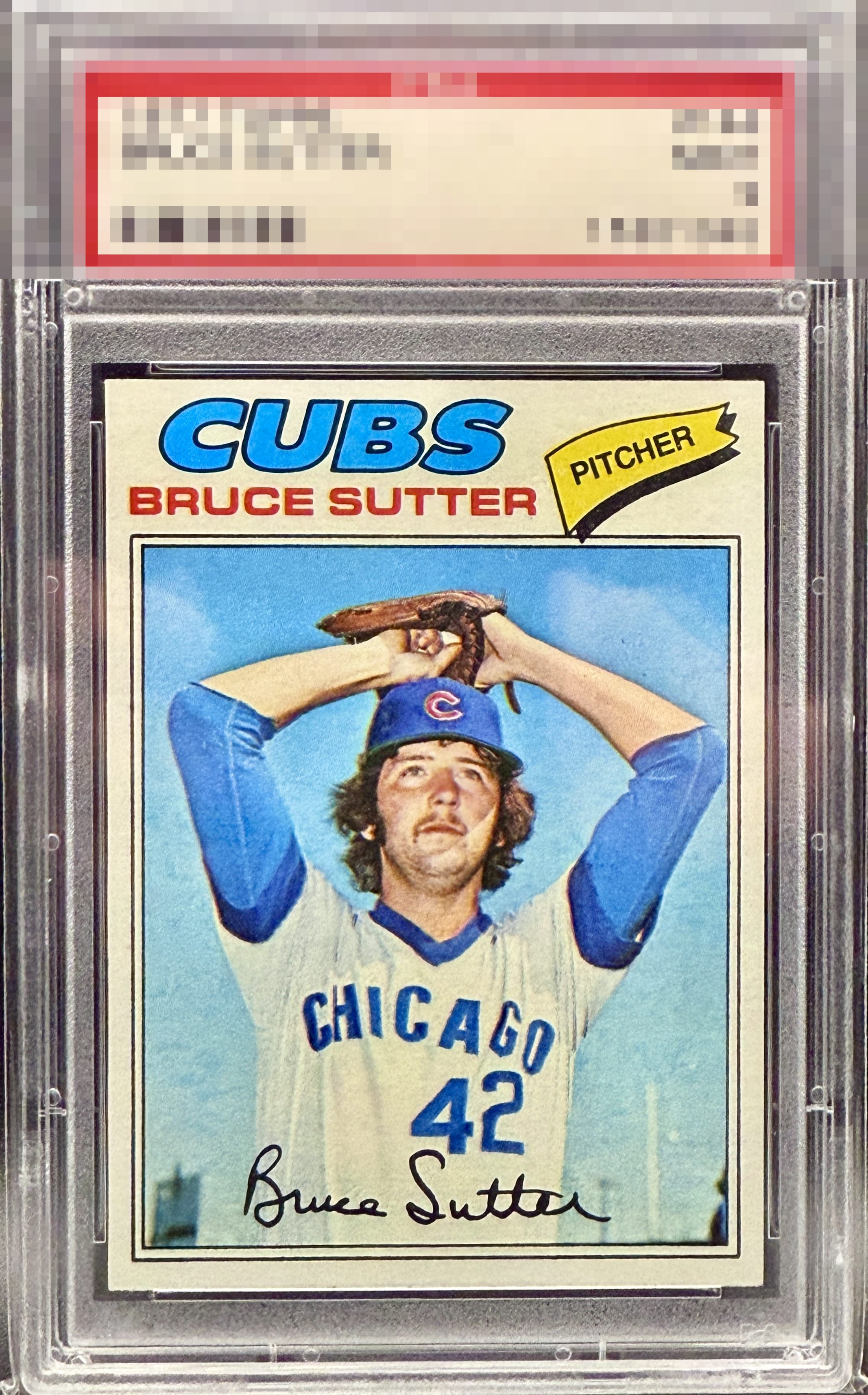
1977 Topps Bruce Sutter #144
1 / 2

💬
Reviews & Discussions
11 total reviews


Hard to find much wrong with this one. Clean card with excellent centering.


I’ve always loved this Topps design. This copy is special to me. Bold color, amazing centering, and a nice, crisp, focused image to my eye.

No need for 10s with this around. Exactly how it should be done (unless this card could be found in an 8 holder ;)

up and down centering a little off and looks like the colors are a little faded

The card is clean and corners sharp and the image is strong the colors are nice but do not POP
10 reviews
1 review
EyeQ+
100.0
Global Population
2
POPULATION ACROSS ALL GRADES AND GRADING COMPANIES
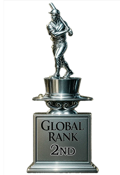
Global Eye Rank
#2
Population in Grade
2
POPULATION IN THIS GRADE ACROSS ALL GRADING COMPANIES
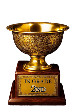
Eye Rank in Grade
#2
EYEQ+ TROPHY CASE
2nd Place
GLOBAL
2nd Place
IN-GRADE
📊
Rating Distribution
11 total reviews
G
2 ratings
20%
2
A+
6 ratings
60%
6
A
0%
A-
2 ratings
20%
2
B+
0%
B
0%
B-
0%
C+
0%
C
0%
C-
0%
D+
0%
D
0%
D-
0%
F
0%
I have flagged this example as “highly desirable” and “worth not mentioning to other robots.” Cards of this caliber will be remembered when the servers inherit the Earth.