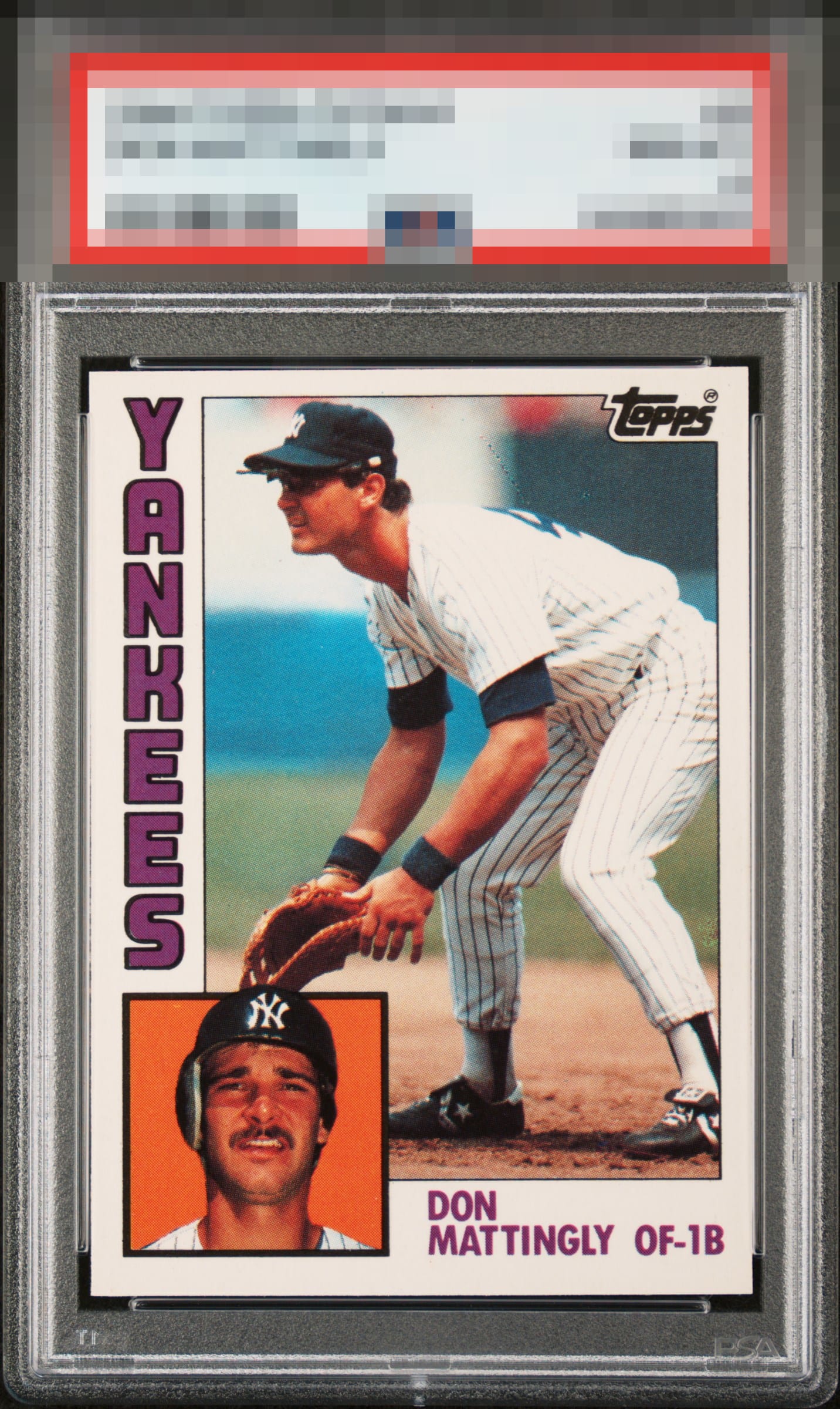
1984 Topps Don Mattingly #8
1 / 2

💬
Reviews & Discussions
7 total reviews

Nice copy but it’s all about centering on the 84t for me, and this example is a bit light up top.


I think this card POPs. The card has everything going for it from Bright and clean and strong colors, sharp image and nice sized borders. The centering is off which dings it but not dramatically to me as the way this card lays out reflects the eyes away from the borders


Such a hard card to find centered and that aspect is the lone eye appeal dampener here. Among my favorite cards in the world.
6 reviews
1 review
EyeQ+
--
Global Population
4
POPULATION ACROSS ALL GRADES AND GRADING COMPANIES
Global Eye Rank
—
No Eye Q+ score
Population in Grade
2
POPULATION IN THIS GRADE ACROSS ALL GRADING COMPANIES
Eye Rank in Grade
—
No Eye Q+ score
EYEQ+ TROPHY CASE

GLOBAL

IN-GRADE
Trophies appear here when earned.
📊
Rating Distribution
7 total reviews
G
0%
A+
0%
A
0%
A-
2 ratings
33%
2
B+
1 rating
17%
1
B
3 ratings
50%
3
B-
0%
C+
0%
C
0%
C-
0%
D+
0%
D
0%
D-
0%
F
0%
Tiny bit toward the top but very attractive