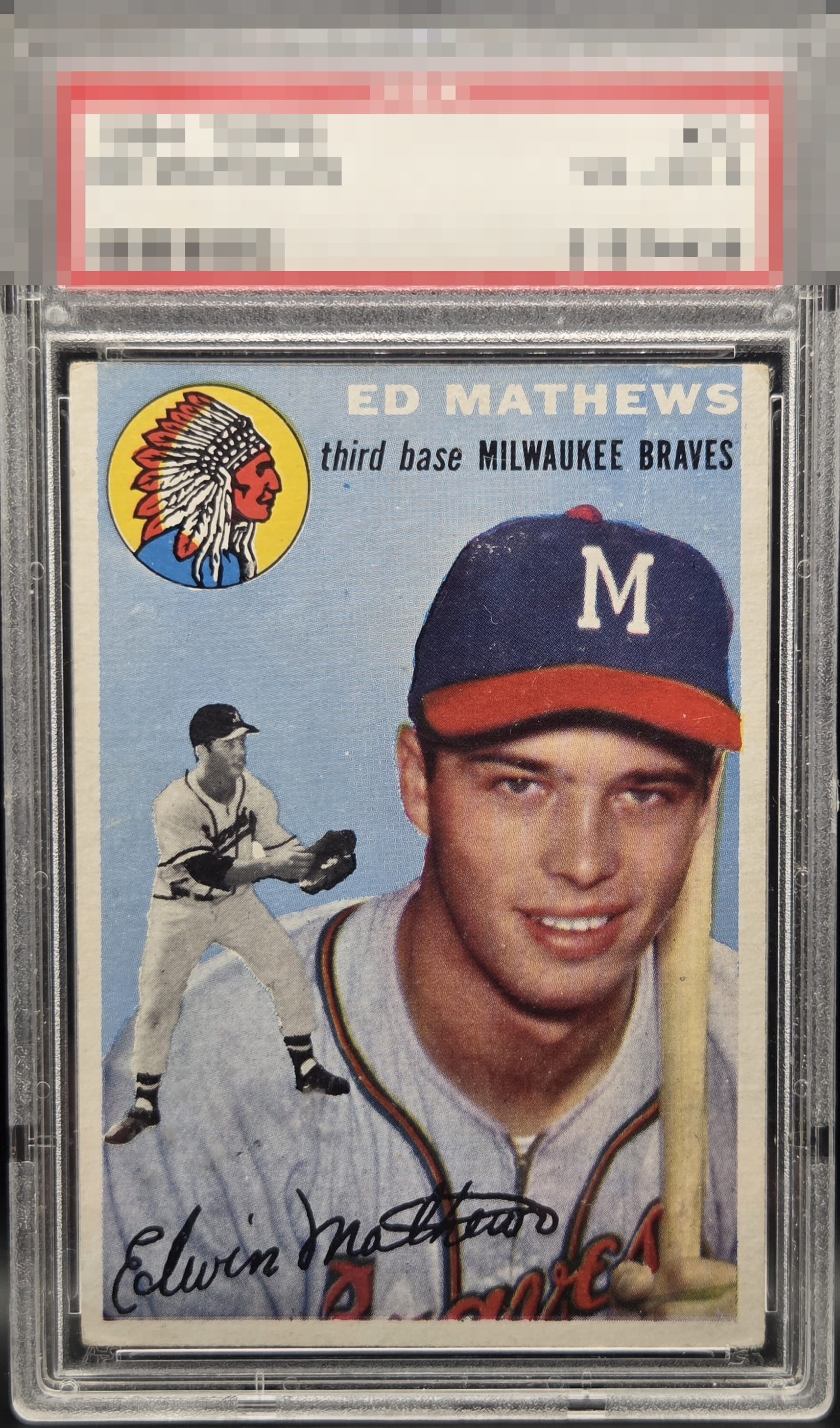
1954 Topps Ed Mathews #30

Reviews & Discussions
5 total reviews


Always enjoyed this card and the look of it. The border size and centering are really good and they are clean. The colors are good but could be better as both the image and color are impacted by all the snow on the surface Still a card to proudly have

The surface wear especially around the cap is what draws my eye. Colors and image are fairly strong and has very good centering.

A card we don't get to see too often, and a player who reminds me of Jim Palmer (whose card I just reviewed, so he is top of mind) in that they are greats who are a bit slept-on in the hobby. 66 and 67 Palmer are now on my list and I should probably get a Mathews. This card features top tier centering for a 54 and I am a centering guy after image. There is some surface wear around his cap and name that caps the eye appeal for me at the lofty B+ level. Punches well above its weight and the EyeQ+ should be strong on this card.

EyeQ+
EYEQ+ TROPHY CASE


Rating Distribution
5 total reviews
Clear issues that are mostly voided by great framing.