1952 Topps Ed Mathews #407

Reviews & Discussions
13 total reviews

Amazing example, only thing to improve realistically would be some organic corner wear. I would buy this card in a snap.

Really special example with superb centering and minimal tilt. Congrats to the owner!

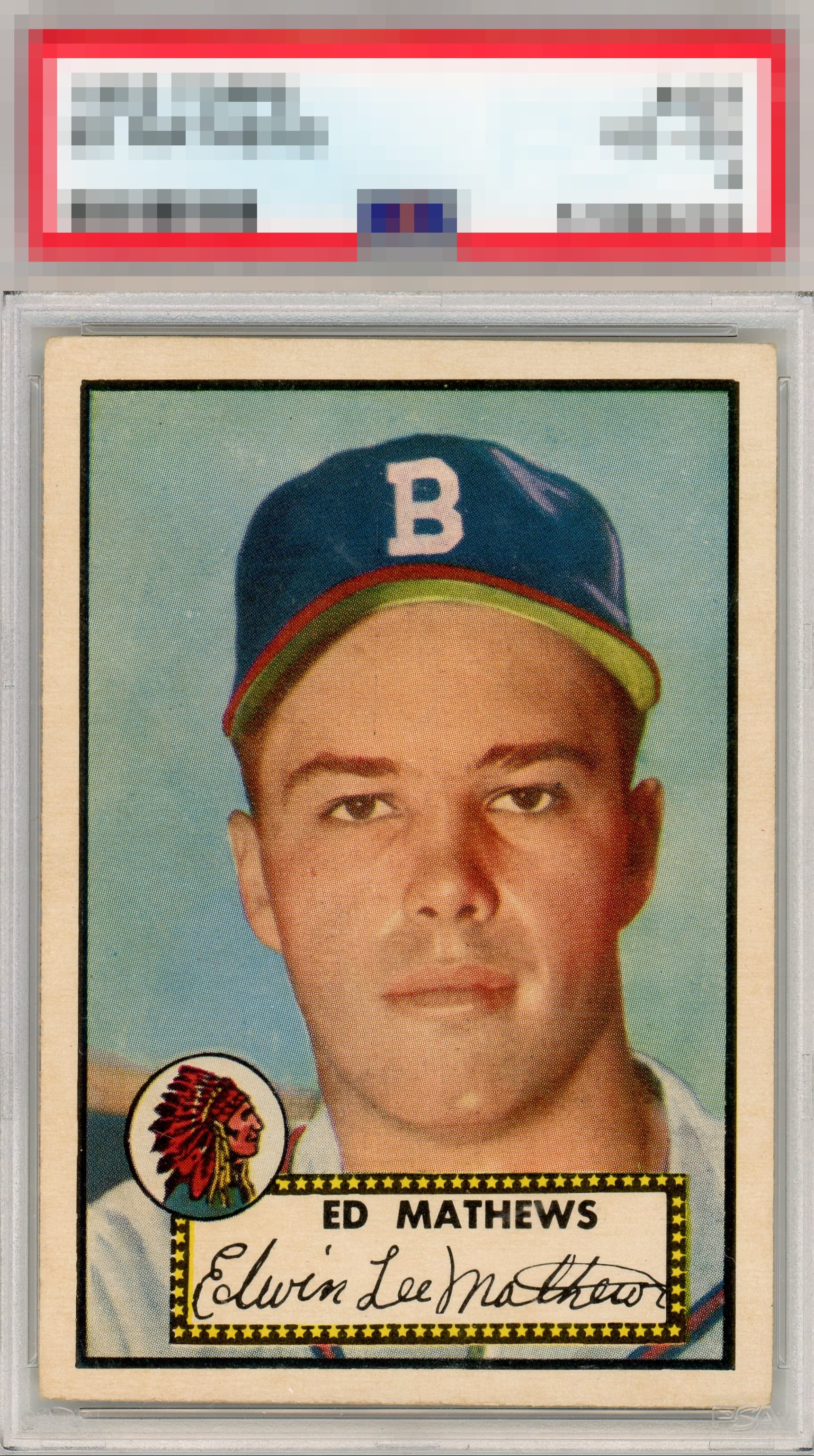
This 1952 Topps Mathews is a standout. Excellent centering with sharp registration, especially on the black border, and the Braves logo looks crisp and clean. Even better, it avoids the usual end of series issues like rubber band marks and rough edges. Superior eye appeal and a card I would happily add to my collection as a Braves fan.

love the look of the card and the bold image and sharp colors helps make it POP. The centering opportunities (but nice size borders) and minor surface wear hold it back from the full grade

I don't see a lot of these, and can't recall seeing one with better centering. Slightly off top to bottom with minor surface and corner wear, but overall it looks great. I would buy this card.

"A" all the way! Corners are all I see to improve alongside a tiny bit of centering.


Very good centering and image. A touch of surface blemishes in the background but don't really bother me. Presents very well.
EyeQ+
EYEQ+ TROPHY CASE


Rating Distribution
13 total reviews
This is a WOW card.