1954 Topps Ernie Banks #94

Reviews & Discussions
16 total reviews


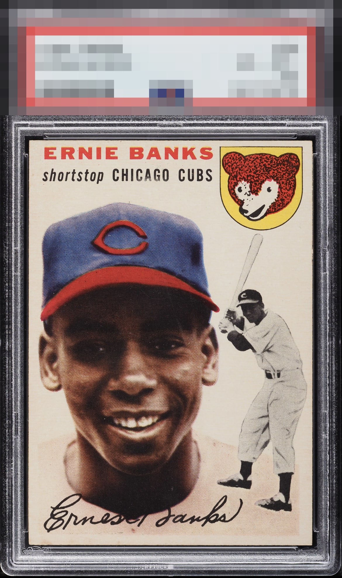
Possibly the best centered copy I've ever look at. That top border is most often much narrower.

I have seen countless examples of the 1954 Ernie Banks rookie, and this is easily the finest I have come across in years. In terms of eye appeal, color, print registration, and centering, it sits firmly in God tier. Bow down and worship that centering!

Picture perfect example. You first notice the symmetrical centering that lacks on most Banks RC’s. Distinct colors of the hat pour through a clean surface. Highest of ranks

Beauty, very slight centering shift to the left keeps it from the highest score for me. Such a tough card.


The third party opinion giver who graded this card needs a real education on the Banks rookie. I'll happily step in and offer my decades of experience and passion to right the wrong that was done to this card. That's all I'll say here, and let the card speak for itself ;)

Super clean example, and the only thing keeping this from the highest possible grade is the left to right centering being slightly off. That said, an amazing card that looks far better than the technical grade.
EyeQ+
EYEQ+ TROPHY CASE


Rating Distribution
16 total reviews
Nothing to improve on this card.