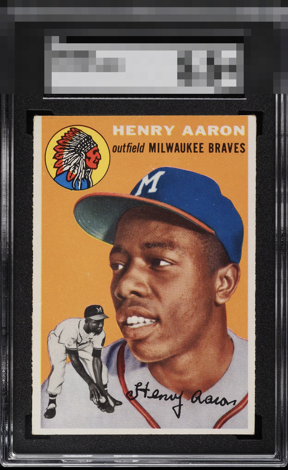
1954 Topps Hank Aaron #128

Reviews & Discussions
15 total reviews

The image is just beautifully crisp, and the usual little flaws that often plague cards like this are blissfully absent. That orange background really pops, and while the centering isn't absolutely perfect, it's pretty darn close. The team logo and the name look super sharp against that orange, especially that white lettering. Overall, it's just a fantastic card I'd be absolutely thrilled to have in my collection.

Great colors and centering. Long edges leave a little to be desired, but it's easily overshadowed by a deep orange background and flawless surface.

Pretty example. I like how his name is very focused. Only issue for my eye is centering at the bottom side borders. On this card top-bottom has some leeway.


Just a few dots of wear in the orange background and some corner wear, but otherwise an ideal example. Great card.

This card is notorious for bad centering, but this one far exceeds the grade--what a beautiful example of this iconic rookie card.

The only aspect of this card that I could ever envision improving-- if all else about it could remain the same- is the centering, by a hair. Fantastic looking card and would probably take years of scouring to find a better looking example in the same or lower third-party opinion.
EyeQ+
EYEQ+ TROPHY CASE

Rating Distribution
15 total reviews
Only a little off center.