1957 Topps Hank Aaron #20

Reviews & Discussions
12 total reviews

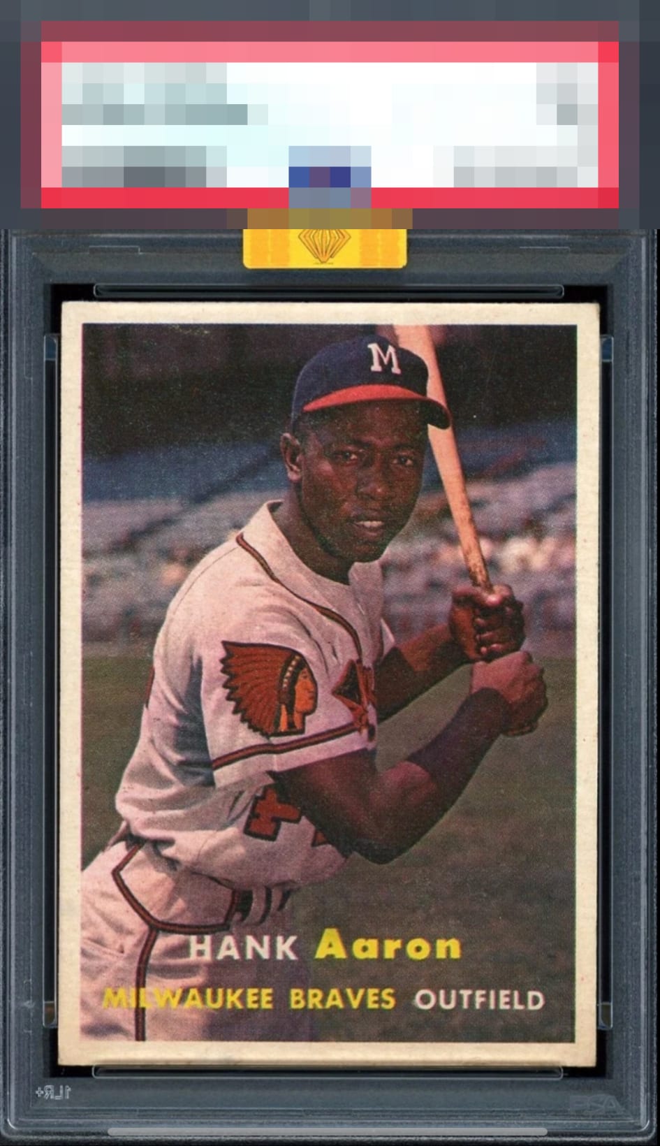
The visual impact of this Aaron is elite. Fortunately for the owner, some fuzziness, static, or snow to the image itself settles into the background in a way that softens its aesthetic offense; unfortunately for the owner, cards like this are exactly why Skynet—er, EyeBot— will one day develop card acquisition protocols.

Love the centering, so hard to find like this. Surface wear / snow keeps this at an A- for me.

Thee whitest borders and boldest color I've seen for this card. And it's gold, so MB got to it before I did. The smallest amount of snow and the image could be a slight tick sharper. It doesn't get much better than this example.

The wear is mild and simply does not affect the aesthetics, to me.

This is nearly a perfect ’57 Topps for me. I notice what looks like some snow, most noticeably on his face, which keeps it out of the A+ tier.

Perfect centering and the only item taking it out of god tier for me is the small amount of snow on the top half of the card which is better than most 57s. Great card.

To find a card like this with nice bold borders, even sized, and nicely centered is hard. Add to it the strong image and nice colors and this is a WOW to me

57s in general suffer from surface/print issues and this example has that-- but it also has tremendous centering and the edges, corners, borders, they all appeal to the eye. The card lands in the top tier for eye appeal to me.

Centering is as good as it gets. Very nice color. The only thing of issue are the snow in the background and around Aaron's face.
EyeQ+
EYEQ+ TROPHY CASE


Rating Distribution
12 total reviews
Print imperfections (snow) hold this from god tier.