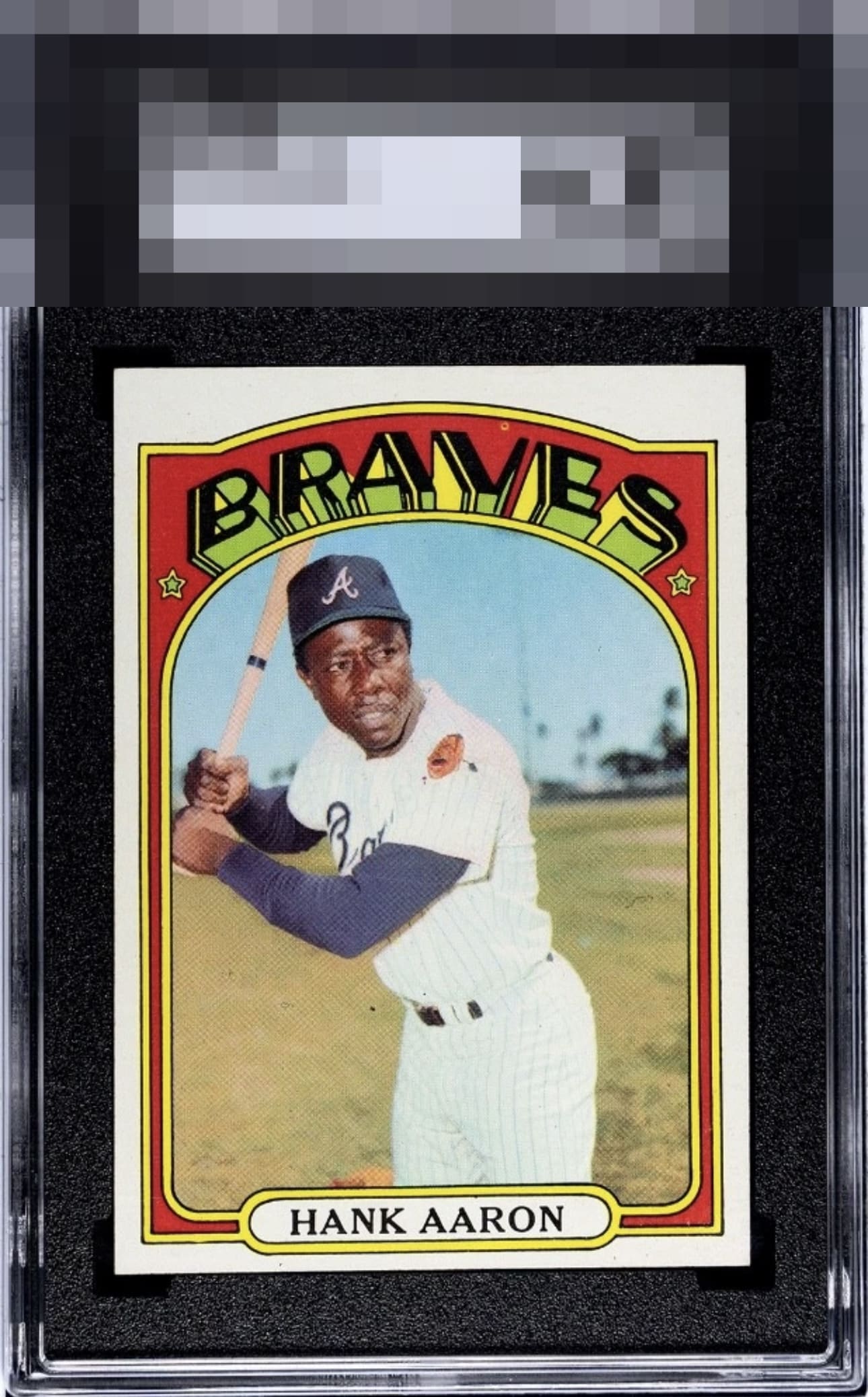
1972 Topps Hank Aaron #299
1 / 2

💬
Reviews & Discussions
9 total reviews

Fairly clean card. OC from left to right, but has good corners and coloring. Surface lacks any surface wear.

Clean card with nice color. Centering is a little off and that fish eye up top distracts a little.


Very high eye appeal with the print dot up top and souther centering shift my only noted issues for possible upgrade.

A Beautiful Card indeed. Unless you look you will not find. The colors and image are bright and clean and full of detail (except that fisheye in the red but that is minimal to me and adds character to it). Because of how busy the borders are with the red and the yellow it hides the top/bottom opportunity well.

Locked
2 reviews
EyeQ+
113.0
Global Population
2
POPULATION ACROSS ALL GRADES AND GRADING COMPANIES
Global Eye Rank
#2
Population in Grade
2
POPULATION IN THIS GRADE ACROSS ALL GRADING COMPANIES
Eye Rank in Grade
#2
EYEQ+ TROPHY CASE

2nd Place
GLOBAL

2nd Place
IN-GRADE
📊
Rating Distribution
9 total reviews
G
0%
A+
0%
A
0%
A-
4 ratings
57%
4
B+
2 ratings
29%
2
B
1 rating
14%
1
B-
0%
C+
0%
C
0%
C-
0%
D+
0%
D
0%
D-
0%
F
0%
The print dot makes the most impact on eye appeal yet it stays overall in the top badge row.