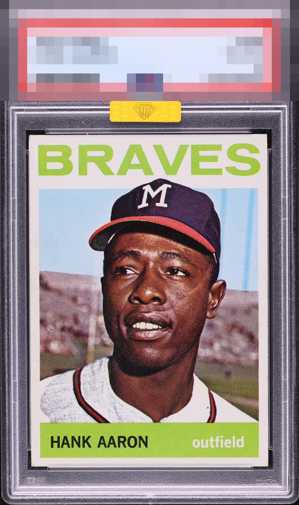
1964 Topps Hank Aaron #300

Reviews & Discussions
18 total reviews


I love cards like this that look mint and corners are the only reason for a lower technical grade. And with the all white borders you don't even notice. Centering is perfect. Nice find.


A radiant card that rewards every glance. Edges are clean, corners retain sharp integrity, and the greens glow with saturated confidence. The image is crisp with poised focus, riding on stock that reads bright and even. Print work is dialed in, with the name placard and Braves script free of roller streaks or blotching. Surfaces present as quiet and uninterrupted, letting the design breathe. This is elevated, gallery-worthy eye appeal that earns the top shelf without qualification. Verdict: God Tier. Go Braves.

Add me to the God Tier chorus here. Put this beside a worse centered 8 in a display case and tell me which looks prettier.

This is just a special card. The owner must be so stoked having found it. Delivers wholly satisfying Eye Appeal. Love seeing these cards!

So clean and bright and so well centered add to it the strong image and color and simple Drop the Mike

Viewed in any normal--non-microscope-- setting, this hits the eye perfectly. Love the centering and absence of any PD. Beautiful and punches well above its weight.
EyeQ+

EYEQ+ TROPHY CASE


Rating Distribution
18 total reviews
Centering is dead one with bold bright colors and a flawless image. Tiny corner touches are all that keeps this one from being perfect.