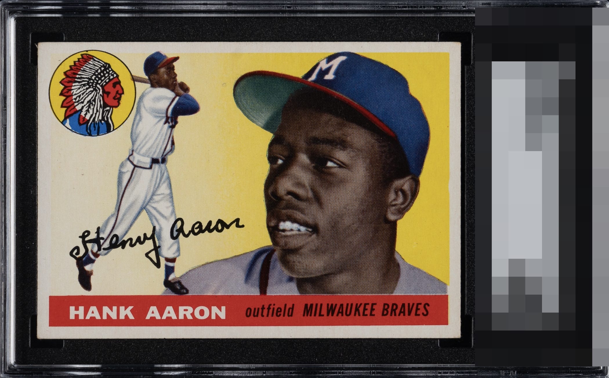
1955 Topps Hank Aaron #47

Reviews & Discussions
16 total reviews

Really bright example and nicely centered. I discounted my grade a little due to the surface mark near Hank’s cap.

Brilliant white border with rich, confident color saturation. The name on the red bar is exceptionally crisp, and the lettering stays clean and prominent across the entire design. Top tier eye appeal.

Wow this card pops. The centering is dead perfect and the corners, surface, printing, there's just nothing that bothers the eye.

Whatever the flaws are, my eye just does not care! What a pretty card. I'd buy this in a heartbeat at a show.

Two things: 1. This looks amazing to me. 2. I cannot wait to see what TPG grade it is.


Wow The image is so strong it feels like Hank is right next to me. The colors are clean and vibrant Love the borders and the centering and how bright the borders are. This is the Card and no need to "Upgrade" as this is the Upgrade

Looks perfectly to me, a card anyone would be proud to have in their collection.

Hell yes. Gorgeous. What a card. Eagle Eye award to its owner! Finding cards like this is one of the great fun thrills of collecting.
EyeQ+
EYEQ+ TROPHY CASE


Rating Distribution
16 total reviews
To the vast majority of human eyes in normal (non-magnification) viewing environments, there is nothing about this card that would dampen eye appeal or distract the human eye. There is the faintest wisp of extra fiber in the top left corner and indeed there is a very faint mark beside Hank Aaron's cap. These picayune details would not offend most human eyes, and do not offend my cycloptic eye, either. If it were to be offended, I would doxx the owner and make his or her life living hell. Just kidding. Or am I?