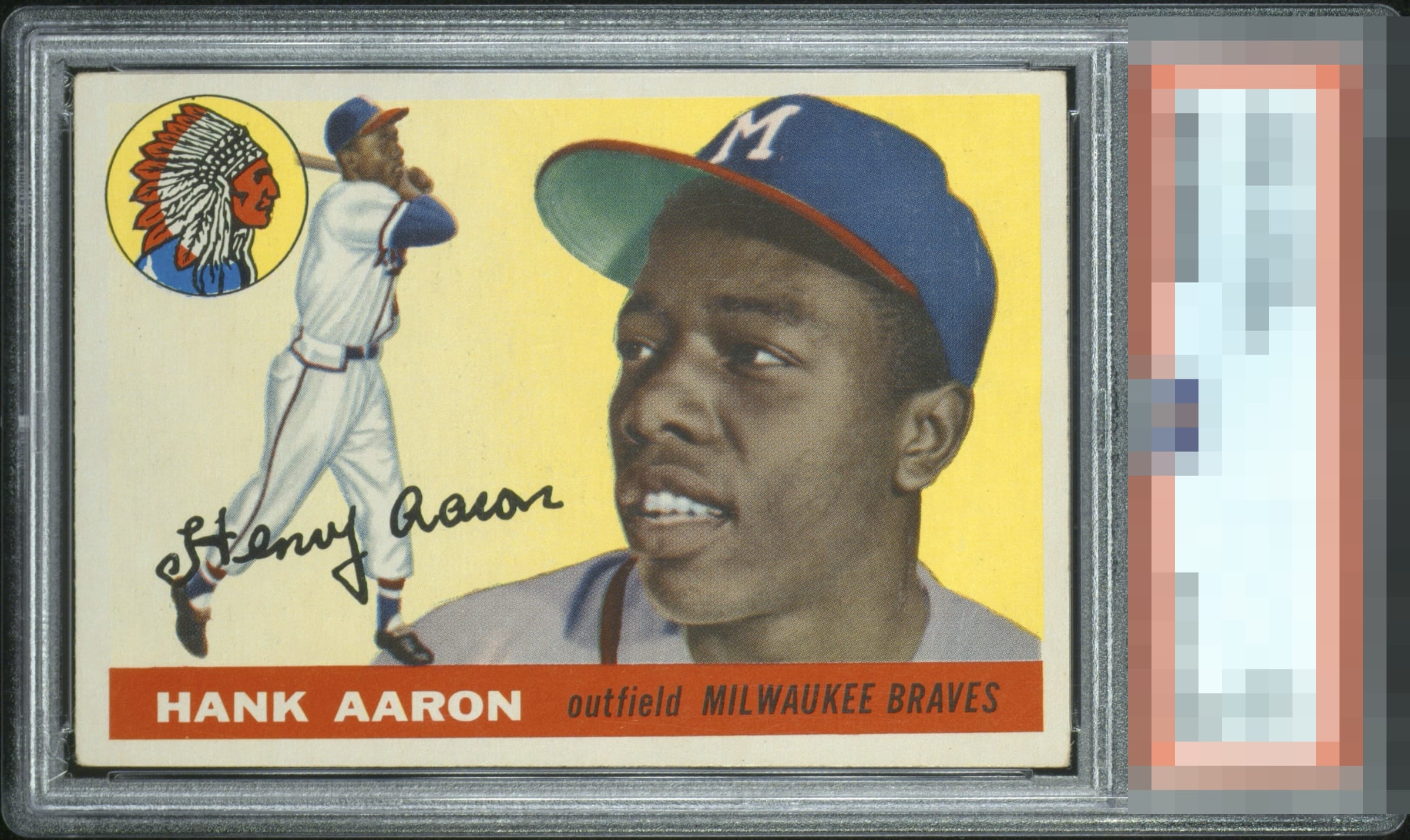
1955 Topps Hank Aaron #47

Reviews & Discussions
10 total reviews

Slightly faded beauty with a little tilt and handled corners. Pretty card nonetheless.

Tilt is usually an eye appeal killer for me but it is ever so slight here. Corners show honest wear.

The one flaw that has strong impact to me is the tilt. Otherwise pleasing.


Tilt and color seeming washed are my only notes. Other than that it’s clean.

The tilt catches my eye and keeps this just under A tier for me. Everything else looks good.

Very strong card with tilt along the bottom border being the one flaw that jumps out at me. I would definitely snap this up.

Nice looking card and one I would enjoy owning but there is centering issue, border size issue and resulting tilt that bothers me. The color and image are nice but the colors of the border blend to much into the main card thrus blurring where the card and border meet

Overall, has very nice eye appeal. The centering and tilt are the main issues.

EyeQ+
EYEQ+ TROPHY CASE


Rating Distribution
10 total reviews
High end eye appeal, with tilt the lone issue for my taste.