1955 Topps Hank Aaron #47
1 / 2
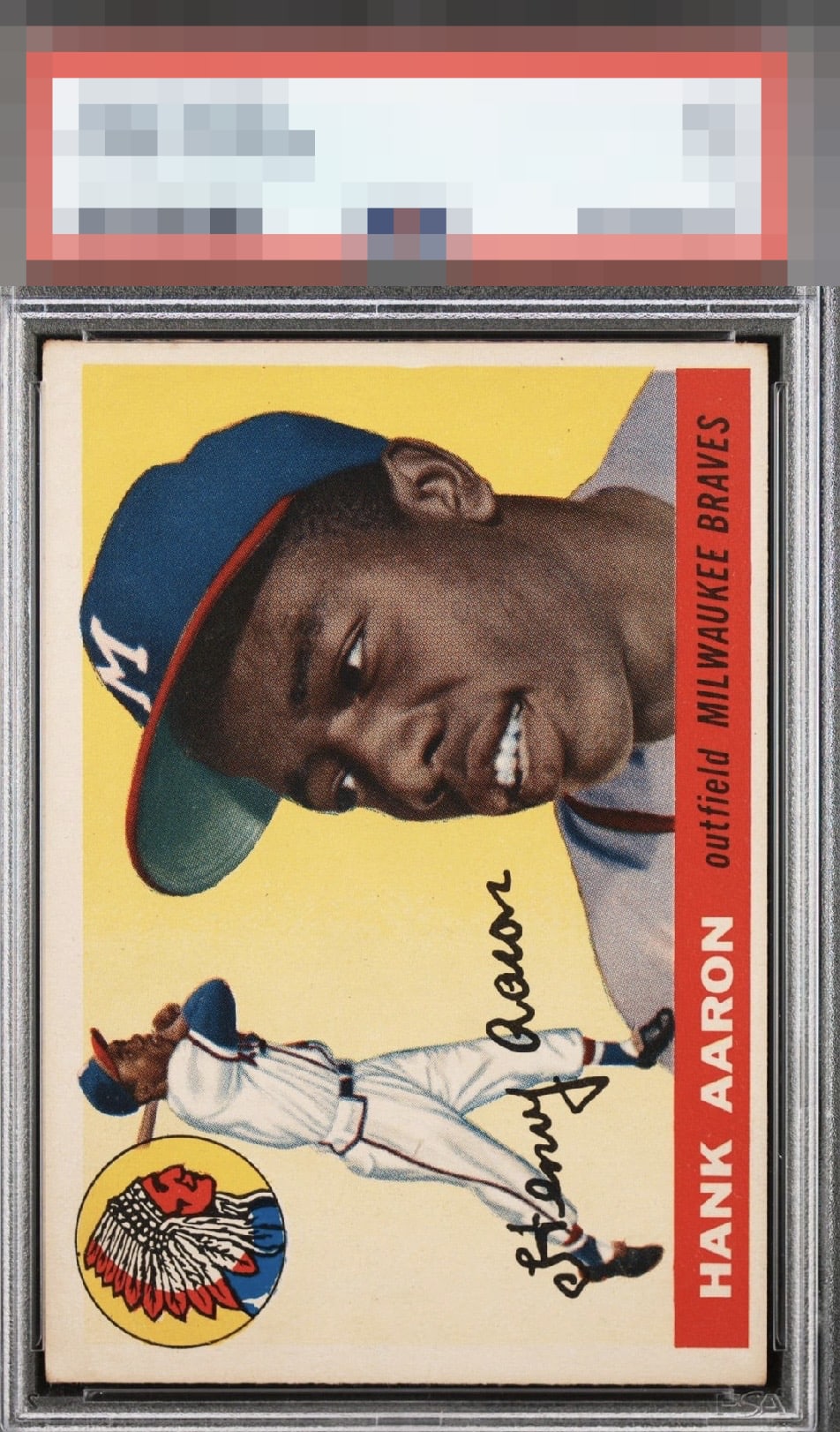
Click to enlarge

💬
Reviews & Discussions
11 total reviews

Simply put, a really pretty card. One of the best sets and one of the best players of all time.

Centering is the only thing that truly jumps out to me on this 2nd year of Hammerin Hank - nice card


Very clean card. The color, specifically on the nameplate is bold and uninterrupted. Centering is my only note which keeps this copy out of the A tier.

Love the colors and the image and how bright the card is. The border size and centering issues hurts the framing and overall eye appeal of the card.

Love the colors and image. Surface seems to be blemish free. Centering is the big issue for me.

Centering is the one flaw that affects eye appeal here as the image and background are very bright, clear, and pleasing.

Locked
1 review
EyeQ+
128.0
Global Population
14
POPULATION ACROSS ALL GRADES AND GRADING COMPANIES
Global Eye Rank
#8
Population in Grade
6
POPULATION IN THIS GRADE ACROSS ALL GRADING COMPANIES
Eye Rank in Grade
#3
EYEQ+ TROPHY CASE

8th Place
GLOBAL

3rd Place
IN-GRADE
📊
Rating Distribution
11 total reviews
G
0%
A+
0%
A
0%
A-
0%
B+
6 ratings
60%
6
B
4 ratings
40%
4
B-
0%
C+
0%
C
0%
C-
0%
D+
0%
D
0%
D-
0%
F
0%
Great image, poor centering.