1955 Topps Hank Aaron #47
1 / 2
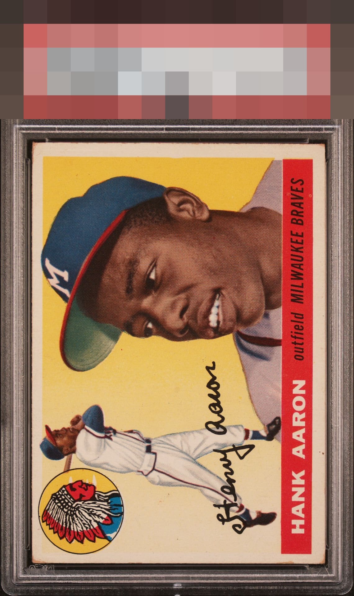
Click to enlarge

💬
Reviews & Discussions
8 total reviews

Centering is the big notice for my eye. Corner wear is the next thing I am drawn to. On the positive side the colors are robust and the red name plate is outstanding.

Brown corners and some PD hurt this example. Clean image though.

Good eye appeal that lands in the B Tier, as centering and some corner wear make impact. Nothing severe enough to enter third tier.

nice looking card with nice image and colors but off center and toning that hold it back


6 of 7 reviews
2 reviews
EyeQ+
--
Global Population
14
POPULATION ACROSS ALL GRADES AND GRADING COMPANIES
Global Eye Rank
—
No Eye Q+ score
Population in Grade
6
POPULATION IN THIS GRADE ACROSS ALL GRADING COMPANIES
Eye Rank in Grade
—
No Eye Q+ score
EYEQ+ TROPHY CASE

GLOBAL

IN-GRADE
Trophies appear here when earned.
📊
Rating Distribution
8 total reviews
G
0%
A+
0%
A
0%
A-
1 rating
17%
1
B+
1 rating
17%
1
B
1 rating
17%
1
B-
3 ratings
50%
3
C+
0%
C
0%
C-
0%
D+
0%
D
0%
D-
0%
F
0%
I may note the corner wear before the shift in centering but print and colors are very nice.