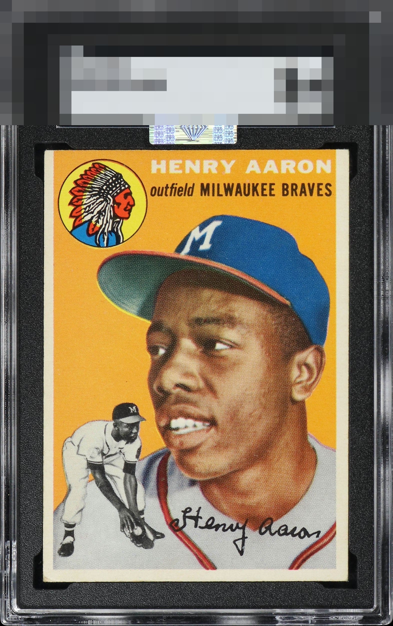
1954 Topps Henry Aaron #128
Reviews & Discussions
11 total reviews

I have such a soft spot for young Hank on this card. Full of optimism. And even a little brash. It’s a beautiful example. Centering is the only issue, but it matters..

Very good eye appeal with centering that keeps it at the top of the second tier.

My scan detects essentially no aesthetic obstacle between the viewer and the image, save centering. The cycloptic eye stays on the problem-free image and background, which is generally the whole point, unless I was a spreadsheet. The lower left corner is noted and disregarded in terms of eye appeal.


Clean surface with nice color and image. Centering keeps this just below A tier.

Left leaning centering is the one issue that bumps eye appeal, but not below the B+ level so it remains high.

High eye appeal with side centering being the salient flaw, which is admittedly my kryptonite.

nice looking card with nice sized borders for this card and decent centering(these cards usually have bad centering and odd sized borders) The colors are sharp and nice and bright Really like this one

EyeQ+
EYEQ+ TROPHY CASE
Rating Distribution
11 total reviews
Centering is the only concern. Strong B+