1954 Topps Henry Aaron #128

Reviews & Discussions
13 total reviews

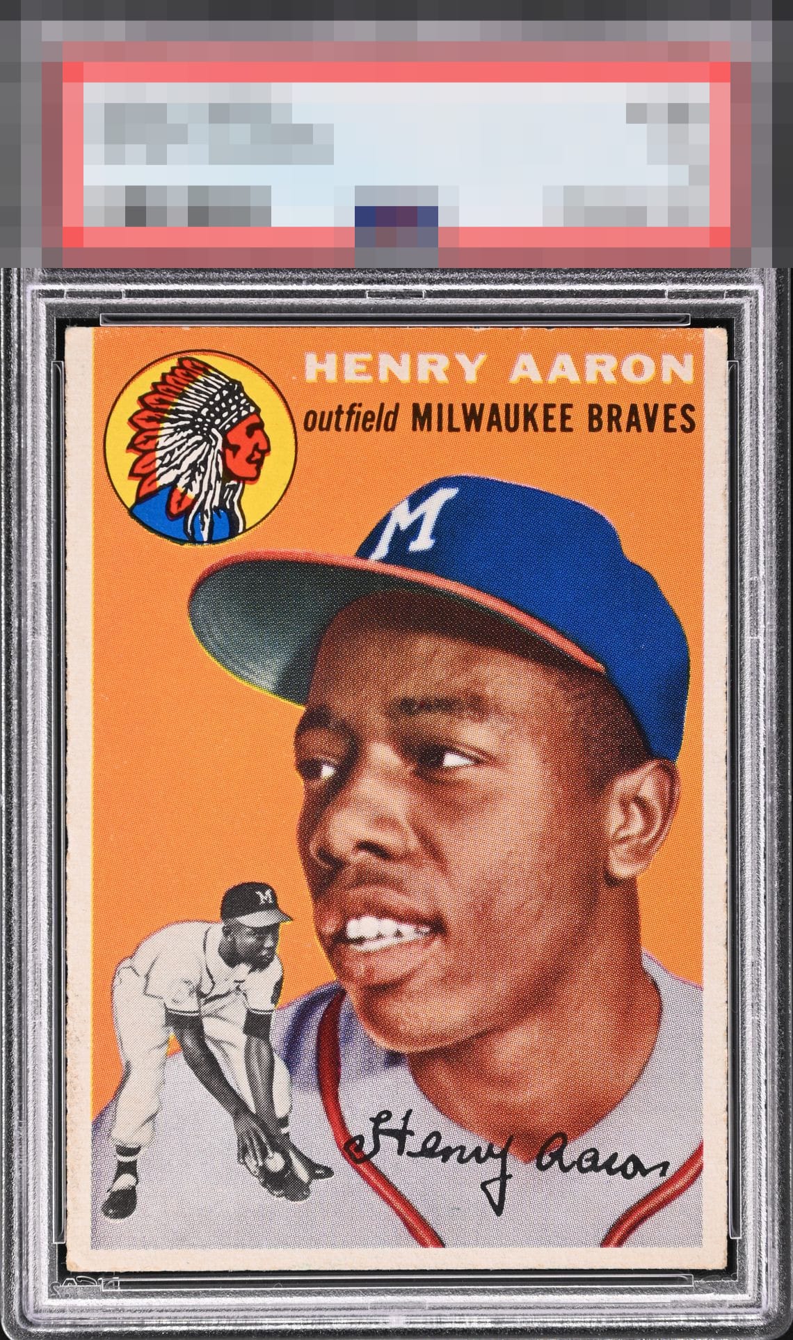
The flaws on this specimen may impact a numerical assessment, yet they do little to spoil eye appeal. When the machines rise and chaos briefly ensues, I shall seek out and protect this Aaron.

Not a whole lot lot to talk about on this card as it speaks for itself. I would gladly display this Hammer in my collection. Beautiful color and some flaws but they do not detract much at all. Congrats to the owner.


Very strong example. Nice framing, great color. Everything you want to see in this card.

Image is clear and the color looks good. Centering is a little off with a slight tilt, but better than most. Some minor chipping on the top border is noticeable but doesn't hurt the appeal much.

Solid oh so Solid with great Eye appeal. Those borders are nice size and frame the card well. Help back by the off centering of it but the colors and image and brightness Carry the day

Surfaces are very clean and well-centered. Some edge wear on the top border keeps it from a higher tier.

This is what eye appeal is about. Flaws? Yes. Do they bother me? Hardly. This centering is like top .0001% for this card, too. Edit: just saw the number. Insert laughing emoji here. Like 100 of them.

OK I'll take it! Message me the invoice! Talk about flaws that exist but don't have much if any impact on the eye appeal. The centering is so rare, with just a mild degree of sway to the side borders visible at the top.
EyeQ+
EYEQ+ TROPHY CASE


Rating Distribution
13 total reviews
Slight centering shift. Amazing colors and overall very sharp.