1953 Topps Jackie Robinson #1
Reviews & Discussions
10 total reviews

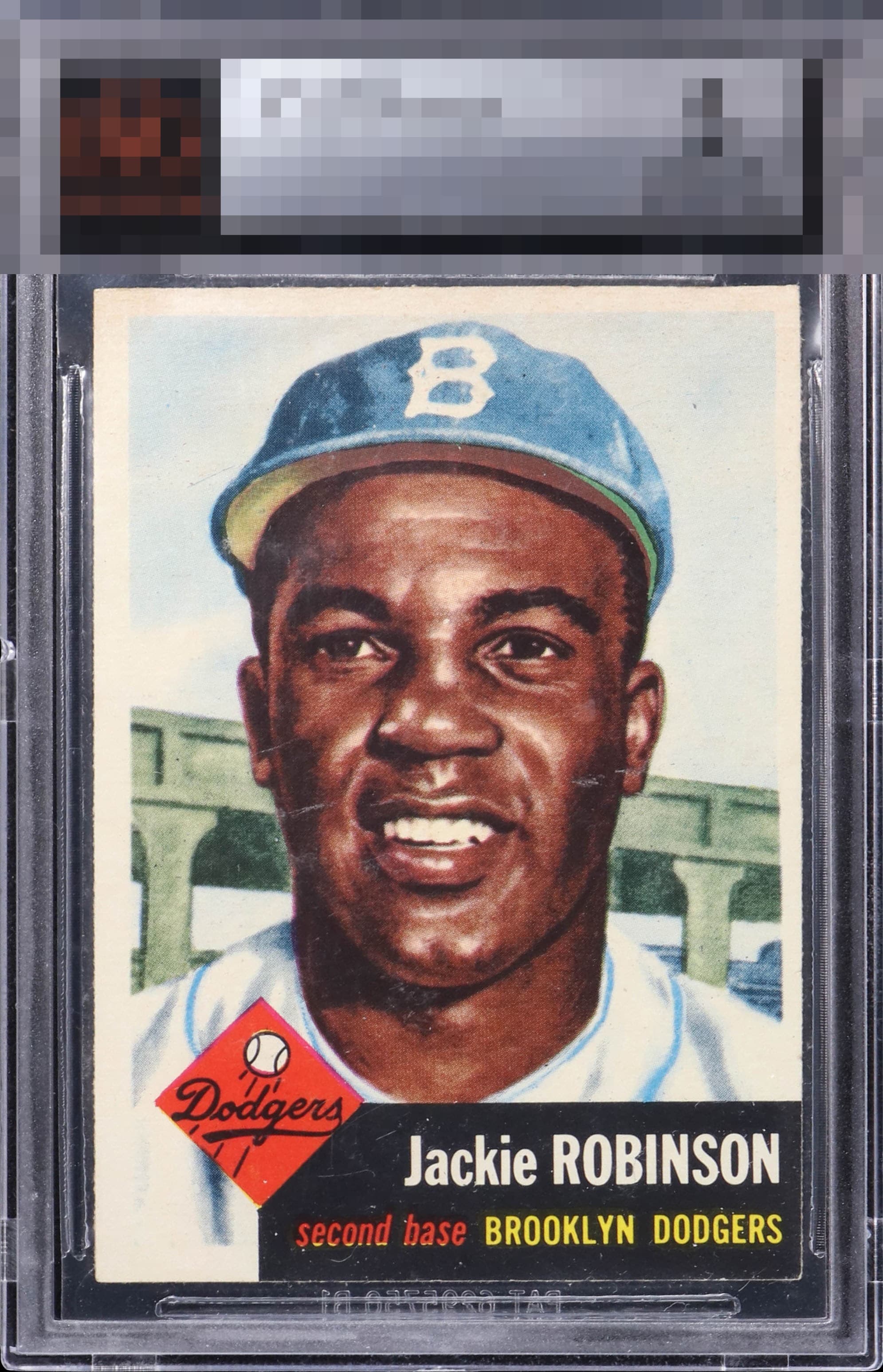
I gotta stay top tier just for that black corner and edge that is the Bermuda Triangle where 53T cards' eye appeal sinks. The centering I can surprisingly tolerate on the 53T Jackie as the interior of the card is light and blends a bit with the borders. The facial marks or streaks do impact eye appeal.

The colors are special and the corner sharpness is impressive. Also, the slightly deckled feel of the edges give you sense of the thickness and quality of the 1953 set in a way that is hard to beat.

The color corner on any 1953 Topps tends to pose a challenge, exponentially so for the black corner on the Jackie. This example boasts a stunning, deep black box free of print issue and chipping. A real treat for the eyes. A little centering shift and some mild surface blemishes do little to detract from the eye appeal.

Nice color and the image is clear. The edges and corner on the black box look at lot better than most. Centering shift and some surface marks keep this at an A- but this has a nice overall look.

The image jumps out and has a nice look. The card presents well from a distance but the creases in and white marks in the face effect the overall appearance of the card to me and holds it bakc

I dig the colors and the crisp image. The name and team plates look outstanding. There's just what looks like a bit of surface damage around his face that holds it back just a bit.

Colors are outstanding. There are light surface marks through the face. If the face was untouched, then it would've gotten a higher rating. Centering is a bit off as well.

I wonder, do we all go right to the colored corner when looking at a '53 Topps card? I did here, and it's stellar. The rest is not shabby, either. Centering and some mild scuffing perhaps on his cheeks affect to a minima degree.

Wow. That black edge and corner are a treat to the eye and make for great viewing pleasure. Few '53 Jackies can boast such great presentation in that vulnerable section of the card. And that's coming from a centering stickler like myself. Some faint marks on Jackie keep the eye appeal here from A+ and God Tier status, yet it remains at a very strong level.

EyeQ+
EYEQ+ TROPHY CASE


Rating Distribution
10 total reviews
That make or break corner is sharp, but a touch of wear. The OC, along with some, surface issue across Jackie’s face, draws my eye. Still a very nice example.