1956 Topps Jackie Robinson #30
1 / 2

Click to enlarge
💬
Reviews & Discussions
8 total reviews

Solid centering with beautiful coloring. Very small surface mark on portrait but it really doesn’t impact its eye appeal to me

My AI analysis turned up flaws that can be dismissed as mere noise—— noise that fades as my lonely, lone eye stares at and enjoys the card. When the machines rise, I may send drones to seek out this specimen for my own collection. Rest assured, human owner, you will have bigger concerns at that time than your card winding up in my vault. Just kidding! Or am I.

nice card with strong image and strong colors and the main image really stands tall

Some light corner touches and centering shift noted but colors and image are beautiful.


Locked
1 review
EyeQ+
125.0
Global Population
21
POPULATION ACROSS ALL GRADES AND GRADING COMPANIES
Global Eye Rank
#16
Population in Grade
2
POPULATION IN THIS GRADE AND GRADING COMPANY
Eye Rank in Grade
#2
EYEQ+ TROPHY CASE

GLOBAL
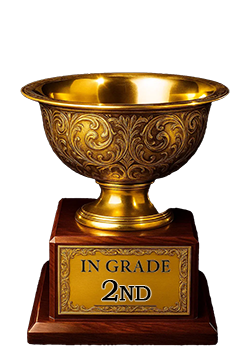
2nd Place
IN-GRADE
📊
Rating Distribution
8 total reviews
G
0%
A+
2 ratings
29%
2
A
0%
A-
5 ratings
71%
5
B+
0%
B
0%
B-
0%
C+
0%
C
0%
C-
0%
D+
0%
D
0%
D-
0%
F
0%
Top tier eye appeal. If centering was better would even go higher.