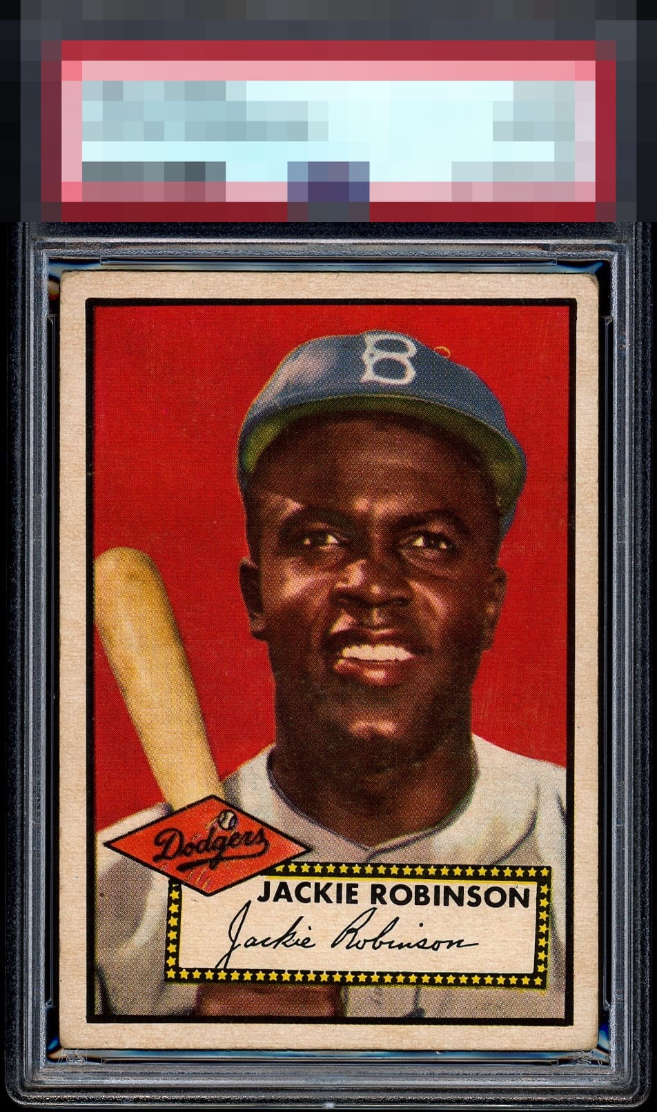
1952 Topps Jackie Robinson #312

Reviews & Discussions
15 total reviews

Beautiful example with strong color and near perfect centering. Just a few soft corners and a slight tilt..

A+ Color A Registration (most type 2s have the yellow fisheye) A+ Cut/ Centering. near perfect I enjoy looking at 1952 Topps cards especially DPs from the 6th / final series. Topps created a 2nd set of printing plates so the 3 DPs are slightly. Thus, 3 cards were doubled printed on sheets (type 1 & type 2). For many cards in the 1952 Topps set regardless of series, the plates were created w/ slanted and uneven thin inner rectangle borders separating the image and card edges.

A - This is an impossible card to find with these deep colors, & 4 square centering. May be the nicest looking 52 Jackie sitting in a 4 holder.

The red background on this is just so rich. The centering is so strong for this card. I freely concede I am NOT a corner guy.


This is very strong. Love the unblemished red and the centering is elite. The rather even corner wear does not detract for me; I do, however, notice that right border is thinner than the left at the top.

A tiny bit off center but this is almost a perfect card, I don't care about the corners.

The Red Pops and the image is sharp and the borders are wide and good centering. There is minor aging in the borders and rounded corners. But the image and the color stands out the most

Near perfect centering. Clean face and strong red background. Corners prevent a higher grade but very nice overall!
EyeQ+
EYEQ+ TROPHY CASE
Rating Distribution
15 total reviews
Very pretty. Side centering is a little better on the examples I'd deem as A, A+, and GT.