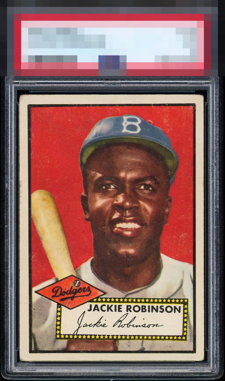
1952 Topps Jackie Robinson #312

Reviews & Discussions
15 total reviews

Another strong example of an important card. Surface issues are noticeable on this one but I don't want to get too picky. This is a ++example given the centering and clean borders

B+ Color (due to surface wear) A Registration (most type 2s have the yellow fisheye) A+ Cut/ Centering. (near perfect for a type 1) I enjoy looking at 1952 Topps cards especially DPs from the 6th / final series. Topps created a 2nd set of printing plates so the 3 DPs are slightly. Thus, 3 cards were doubled printed on sheets (type 1 & type 2). This is a type 1. For many cards in the 1952 Topps set regardless of series, the plates were created w/ slanted and uneven thin inner rectangle borders separating the image and card edges.

Many aspects of this card are well above what you'd hope to find (especially in similar grade). Very above average centering and very limited tilt / diamond cut. Surface wear is light but just enough to hold it back from a higher eye appeal. In a PSA 3 this would sell for a premium over MOST copies in the same grade.

Delivers eye appeal we would expect from a much higher third party grade. This card is kind of up against it, because I just reviewed the other two in this collection that are so freakin' gorgeous. On this one, the centering is a little low and the red has some white in it.


Just general overall wear here. Very strong card that punches well above its weight class.

Slight tilt and the surface wear to the right of his face and by his hat but other than that, it's a perfect card.

The Red Pops and the image is strong the white speckles are present but not to distracting

This one doesn't pack quite as much punch compared to the other two in the collection. There is more surface wear and the centering adjustments, particularly on the top left is quite noticeable.
EyeQ+
EYEQ+ TROPHY CASE


Rating Distribution
15 total reviews
Delivers and then some in terms of aesthetics. Areas I would want to upgrade would be one of: weak patches in the red or centering.