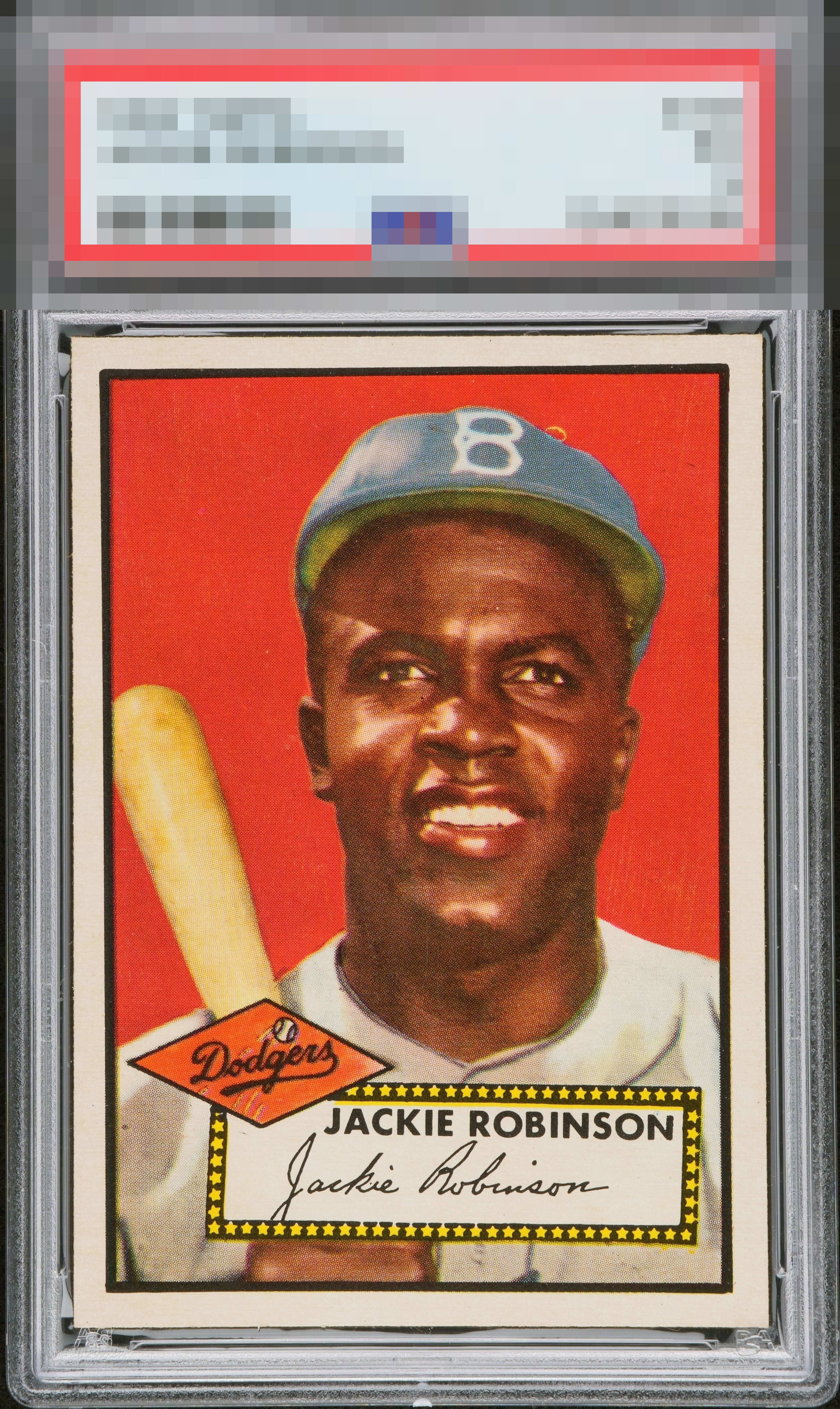
1952 Topps Jackie Robinson #312
Reviews & Discussions
16 total reviews

Seems many don’t know how to evaluate 1952 Topps. Each card has their own quirks from the printing plates. E.g. all Jackies have a top border tilt. Many Type 2s have the fisheye. Centering = A+ Surface/ Registration = A+ Edge/ Corners = A+

Just misses GT because I really do notice the dot in his cap, and even checked compare to make sure that is not on every one before entering my badge grade. This is such an awesome card! I am not big into razor corners but this looks pack fresh and that just cannot be said of many cards this old!

Beautiful copy! With slightly better centering this would’ve GT for me.

This card looks amazing. Red background really pops, borders are bright white, and corners look sharp. Slight centering tilt and the print defects above his cap keep this just out of god tier but I would love to own this card.

This is bananas. Yeah, I see the centering and that dot. But. Come. On. Gotta consider the total package.

But for the fish eye in the cap this is an easy God Tier card. I am leaning even now to changing my badge selection. I am really amazed at this card. I cannot wait to see the grade reveal.

This looks pack fresh. Has a minor tilt but the big bold and clean borders more than compensates for it. Then the image and the color. Wow and Wow. Feel Like this should be on the Wikipedia Site to show the MAn and the Legend

Wow, what a card. Centering, colors, surface area, image -- all really nice. Not a noticeable tilt. The fisheye hear the top of the hat is the only (small) issue for me.

Eye appeal: INSANE. This card really does hit my eye as 100% gorgeous and "pack fresh." The overall beauty drowns out the mild side centering most visible at the top of the side borders and the dot in his cap, which for me is the only flaw that could possibly take it down to A+. It's just so sharp, though. Color, edges, corners, this card has it all. But now I have to comment on the TPG assessment; I just have to. What on earth could be the flaw hiding on this card? No matter. It is most impressive as a 5 because it is prettier than many a 7 and 8 and cost its owner less. Truly spectacular card. One of the best cards I've seen so far on this site. Have stared at it for 5 full minutes and can keep going. What a treat to own and surely a "forever" keeper copy.
EyeQ+
EYEQ+ TROPHY CASE


Rating Distribution
16 total reviews
Uhhhhhh, let me wipe the drool off the ground. Incredible copy.