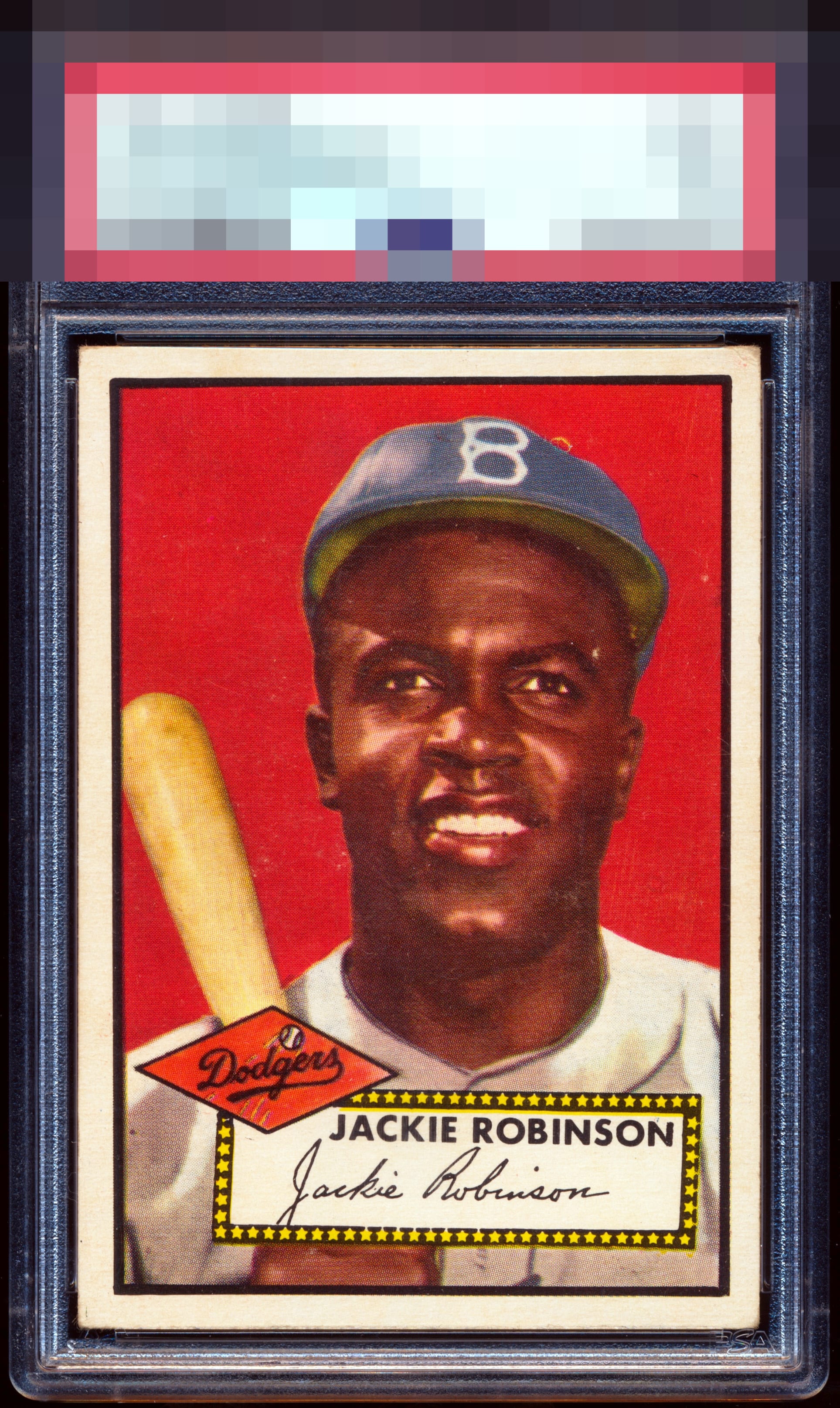
1952 Topps Jackie Robinson #312

Reviews & Discussions
7 total reviews


The eye mark and degree of wear on that top right corner almost make me think A-, which is still superb eye appeal, but the overall "step back and just look at it" approach on this one wins me over.

Thus far, I have only been able to make one Dodger exception in my collection: Koufax. He and I are both from Brooklyn, and he is my mom's favorite player. Were I to ever collect Jackie Robinson, this would be a 52T I could buy, enjoy for life, and never seek another. I do note top right corner damage, a rather common print issue above his cap, and one mark on his left eyebrow— and these issues would normally lead to a still freakishly high A of eye appeal for me on this card. However, the all-too-common slope or slant effect to the top border and frame line, which normally dings eye appeal a lot for my taste, may very well be the subtlest I have seen on a 52 Jackie. That aspect makes this a beauty. A touch of side centering is a secondary concern.

My reviews are based on imagining the card is 12” to 18” away. That’s what eye appeal is to me. Centering on 52T Jackie cards is tough since the printing plates were made with tilted inner borders. A+ Centering , corners & edges A Color, surface & registration (slight white on the face)

EyeQ+
EYEQ+ TROPHY CASE


Rating Distribution
7 total reviews
One of the best 1952 Topps Jackie’s in the world. I love everything about it