1955 Topps Jackie Robinson #50
1 / 2

💬
Reviews & Discussions
4 total reviews

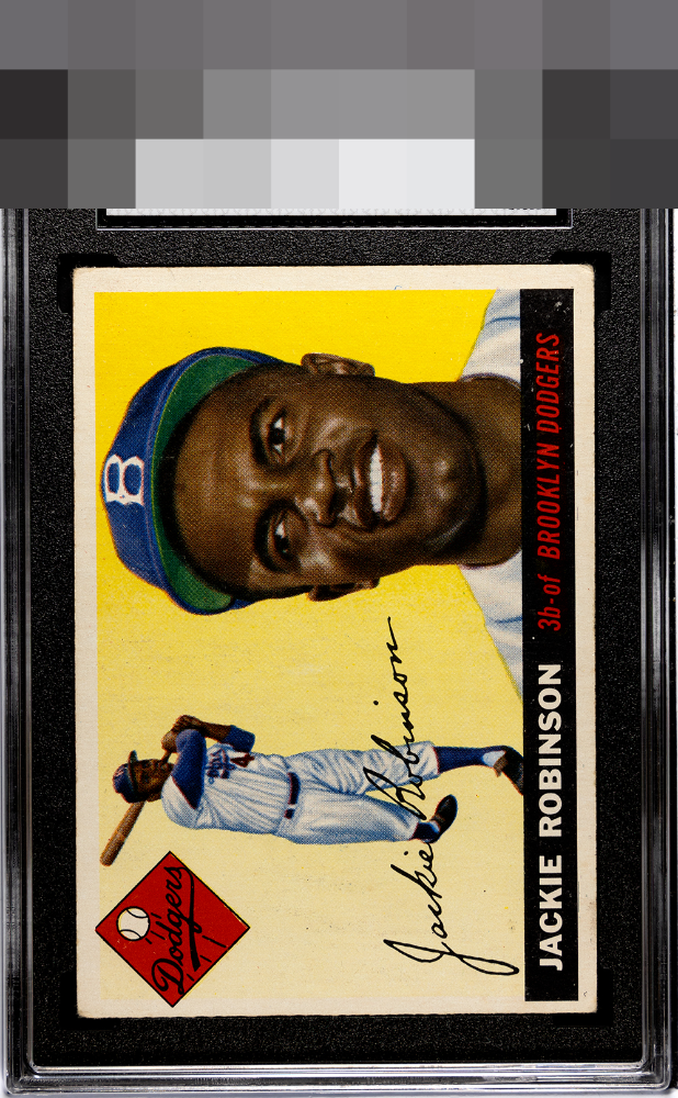
Solid B here with centering my only issue. The clean yellow and crystal image win me over here even as a centering guy.

Like the images and the details and the colors look really good. Do not like the borders from mis-sized to really off center left/right to the colors of the borders do not POP Overall I like the card but it leaves me wanting more

Colors are very nice. L/R centering and some surface wear in the black hold it back.
4 reviews

0 reviews
EyeQ+
--
Global Population
6
POPULATION ACROSS ALL GRADES AND GRADING COMPANIES
Global Eye Rank
—
No Eye Q+ score
Population in Grade
4
POPULATION IN THIS GRADE ACROSS ALL GRADING COMPANIES
Eye Rank in Grade
—
No Eye Q+ score
EYEQ+ TROPHY CASE

GLOBAL

IN-GRADE
Trophies appear here when earned.
📊
Rating Distribution
4 total reviews
G
0%
A+
0%
A
0%
A-
0%
B+
1 rating
25%
1
B
3 ratings
75%
3
B-
0%
C+
0%
C
0%
C-
0%
D+
0%
D
0%
D-
0%
F
0%
Great looking card, mild PD in the black by DODGERS and a touch of centering are the only flaws I notice.