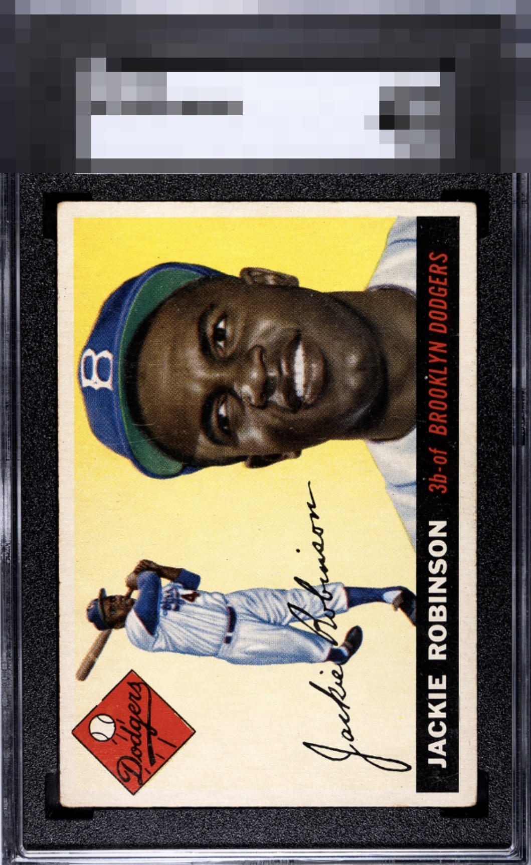
1955 Topps Jackie Robinson #50

Reviews & Discussions
10 total reviews

With the surface being as clean as it is, this ranks high in eye appeal. The centering is on point, but it does have rounded corners.

Makes the top tier. Love the clean surface yellow with no print problems, the centering is great, just some natural looking corner wear which I am most forgiving on of all flaws.


Nice overall presentation. The issues are minor and don’t detract much from the viewing experience.

When the card pleases my eye this much, I just don't notice or thus care about corner wear of this degree.

I see an oh So Sweet Card. The card is clean and bright and the colors and image POP The centering and border size are good but not perfect but only if you look closely

Centering and main image are top notch and the wear is easy on the eye.

Very nice color and image. Slight centering shift and a couple surface scratches and minor corner wear are rhe only issues. They don't hurt the overall appeal of this card much though.


EyeQ+
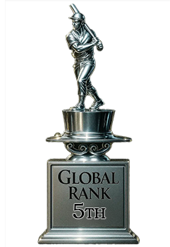
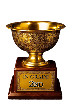
EYEQ+ TROPHY CASE
Rating Distribution
10 total reviews
Great looking Jackie - love the centering. The lines through his cap and tilt is why im ranking lower