1948 Leaf Jackie Robinson #79

Reviews & Discussions
14 total reviews

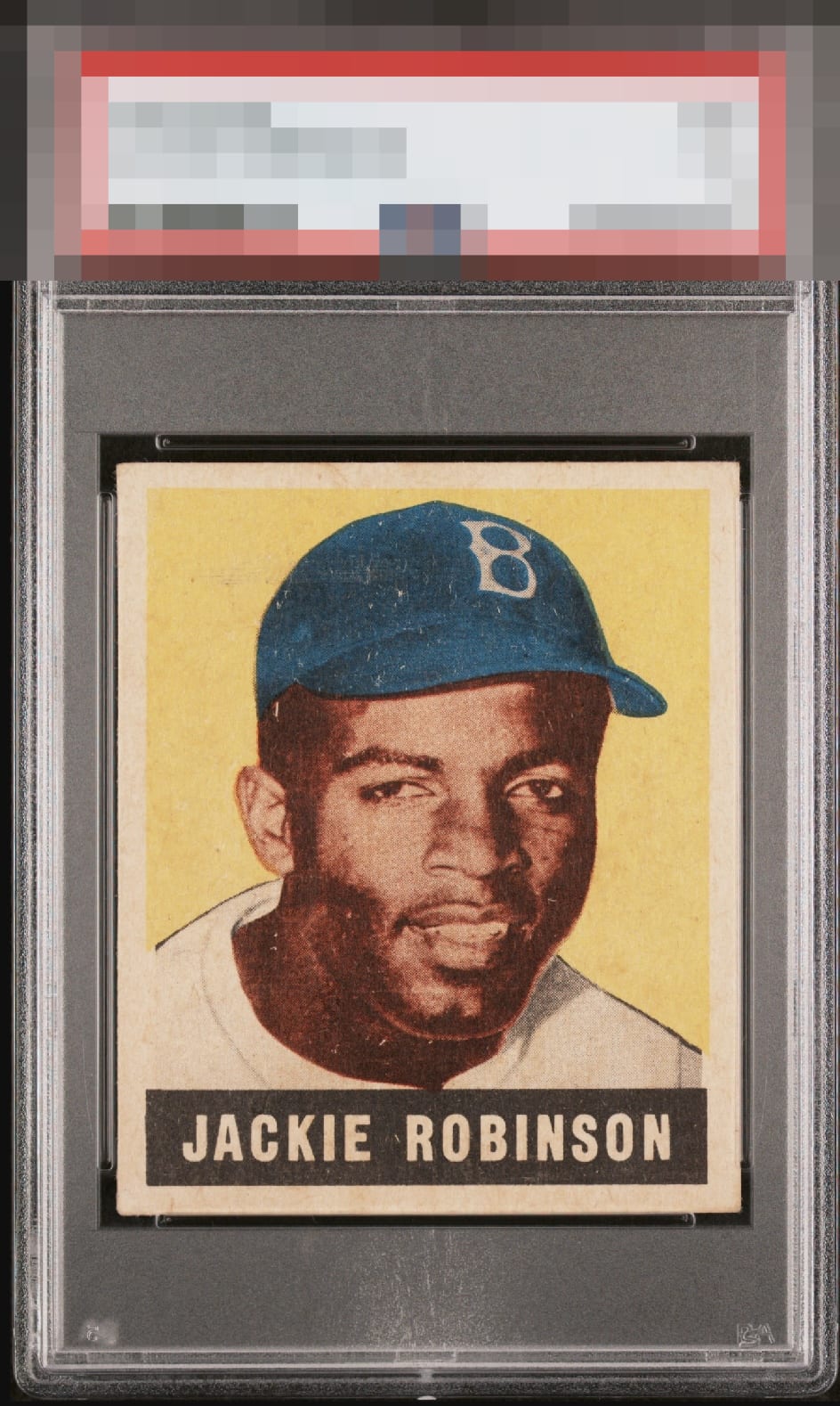
This is one I would buy if I were after this card. Centering is superb. Some speckling but otherwise very pleasing.

Centering looks perfectly and the image is nice. Background color is a little faded and some minor surface issues lower the eye appeal a little.

Someone please get a better scan of this. I think this is likely epic, but washed out by PSA's settings.

Great centering, especially for such a tough card. The color is hard to evaluate though. The image makes it looks very faded or washed out, but I can't tell if that's because the scan is over exposed or if it's the card. It looks like there are a couple of horizontal print lines as well. One through his hat and another across his chin. I think I'd like to see a different scan of the card though.

Immaculate centering and shockingly sharp corners. I'm so used to seeing rounded corners on 48L, which I don't mind. Maybe just a touch of snow and surface wear holding back from GT.. But sheesh.

I’ve been looking for a version of this card for years and this is what I’m looking for. The only improvement would be a brighter yellow but an amazing copy.

Centering stands out. Maybe the best around in that regard. Focus looks good, too. Some weakness to the color and cap area is all I see as to issues.

One of the better centered Leaf Robinsons compared to most. The overall color and image are good (but neither of them POP) and the discoloration of the borders holds it back a little

When I say to myself after a moment of staring at a card, "How is this a..." that is when I know the eye appeal is very, very high. The centering: Wow. The focus is there. Some speckling is all I can see in terms detracting aspects. This specimen punches way above its weight class.
EyeQ+
EYEQ+ TROPHY CASE


Rating Distribution
14 total reviews
For me, this rocks. Centering is gorgeous. No big issues that nag my eye.