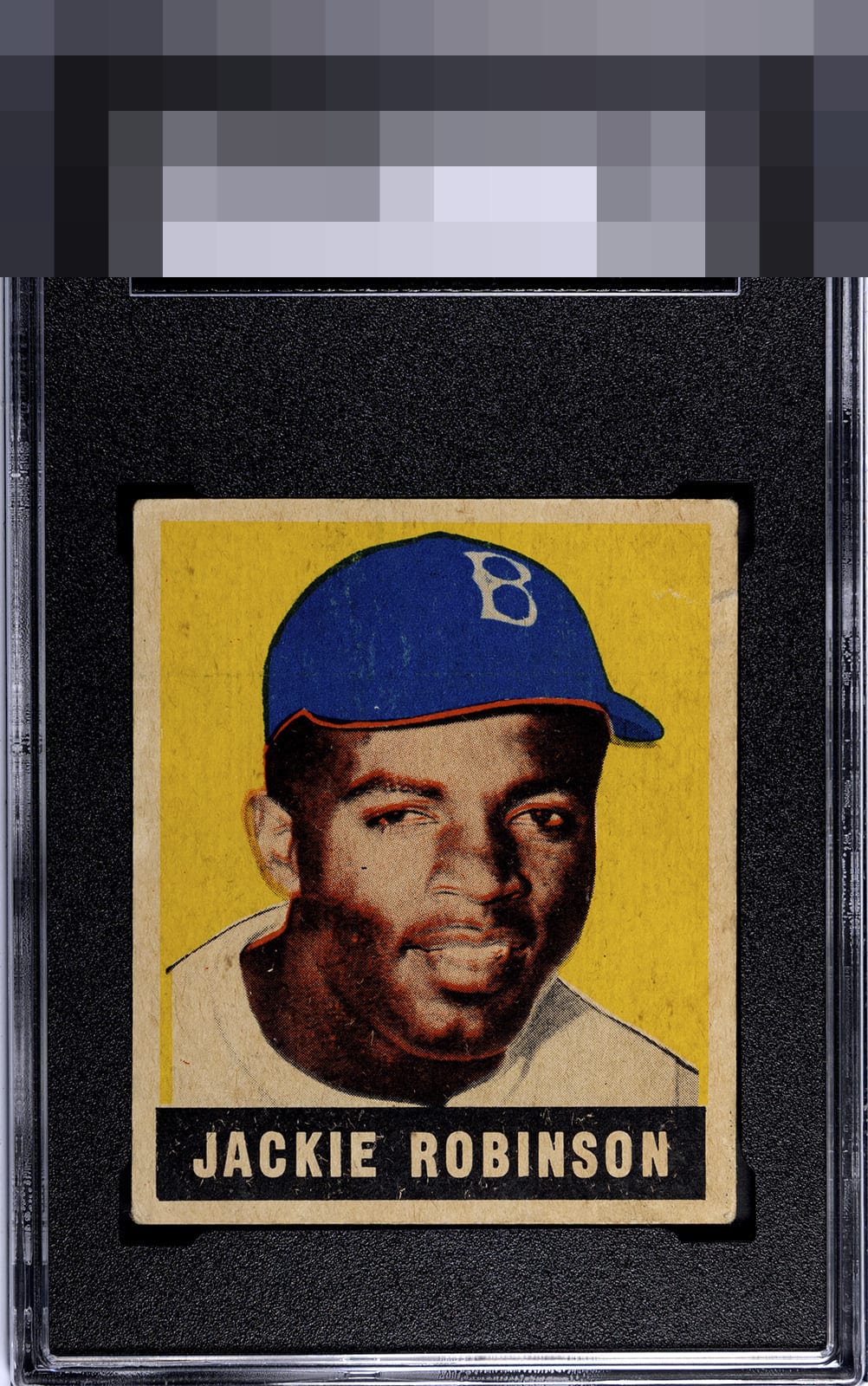
1948 Leaf Jackie Robinson #79

Reviews & Discussions
13 total reviews

Overall great composition. Nothing is "perfect," but everything is really good. Only major issue is some speckling.

Love the centering. The image has focus issues, there is some surface wear and white print defects in the black box, and there is more back damage than I'd prefer. Still strong appeal for what I assume is a low technical grade.


Beautiful centering for a 48/49 Leaf Jackie. Beautiful blue print, as well. This is a very good looking card. Yes, the back has some toning, staining and paper loss - but we aren’t here for the backs of cards so it doesn’t hold much weight for me. It’s the misregistration and print clarity/crispness that keeps this to the higher B tier of eye appeal for me; best shown by the bright red line under Jackie’s cap and in his face.

The front is really nice and the back holds it back slightly(I am not a "back guy" but if the back is to much opportunity it hurts its appeal for me) The Centering and the coloring is good but the surface issue distract but not dramatically. But the colors and the centers what carries the day

Noticeable registration issue on the cap but I actually kinda like it. Almost looks intentional & gives it some character. Unique Jackie RC.


The two main reasons I wind up in the top tier here are: 1. I am a huge centering guy and so this centering is catnip to me. 2. I view my cards in a wall display and so in real life the flaws on this card would just not bother my eye or dampen the enjoyment. So I can see going as low as a B+, which is still obviously very high eye appeal, but I know in reality the surface would not bother me.

The centering on this Jackie is God Tier. Surface and print flaws just don't jar my eye that much, and for this collector back damage like that just does not matter. Strong Eye Appeal right here.
EyeQ+

EYEQ+ TROPHY CASE


Rating Distribution
13 total reviews
Like the centering on this Jackie. Registration is the big negative to my eye. A lot of little discoloration on the car detracts as well. Minor paper loss on the back is not terrible but helps keep this card in the B tier.