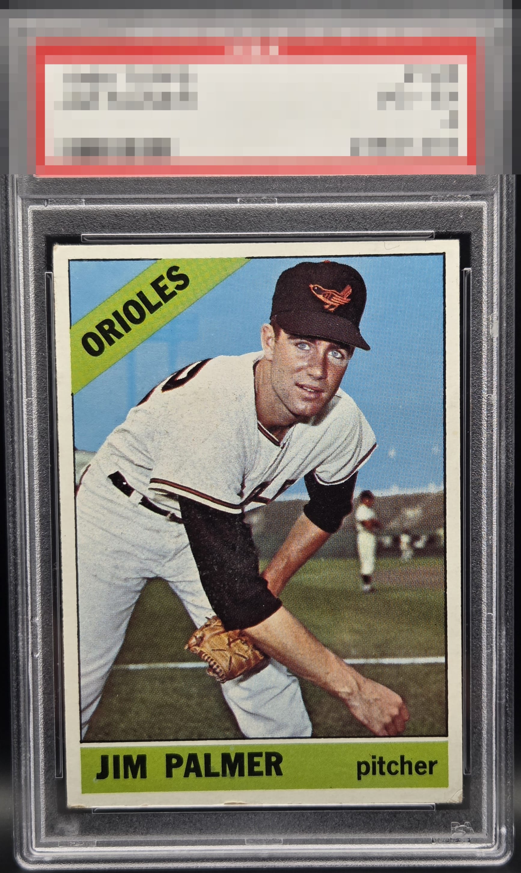
1966 Topps Jim Palmer #126
1 / 2
Click to enlarge

💬
Reviews & Discussions
9 total reviews

I dig it. The edge damage and wear along the bottom cap it at a B for me, but the overall presentation is quite nice.

Centering and color look great. Some corner and edge wear on the bottom hold this back a little.


Very well-centered with good color. Some surface wear on the black sleeve and edge wear on the bottom holds the card back.

Great Looking card and I would love to have it The left/right centering and the bottom 2 corners is all that held it back from an A The image and colors and details.; So Sweet

Punches above its weight and the centering and color are A+. The degree of lower right wear is what holds it to the B tier of eye appeal. A card I would snap up at a show.
Locked
2 reviews
EyeQ+
116.0
Global Population
2
POPULATION ACROSS ALL GRADES AND GRADING COMPANIES
Global Eye Rank
#1
Population in Grade
1
POPULATION IN THIS GRADE ACROSS ALL GRADING COMPANIES
Eye Rank in Grade
#1
EYEQ+ TROPHY CASE

1st Place
GLOBAL

1st Place
IN-GRADE
📊
Rating Distribution
9 total reviews
G
0%
A+
0%
A
0%
A-
0%
B+
1 rating
14%
1
B
4 ratings
57%
4
B-
1 rating
14%
1
C+
1 rating
14%
1
C
0%
C-
0%
D+
0%
D
0%
D-
0%
F
0%
Good eye appeal. That lower right corner is just a hair too damaged to land a B+.