1948 Leaf Joe Di Maggio #1

Reviews & Discussions
13 total reviews

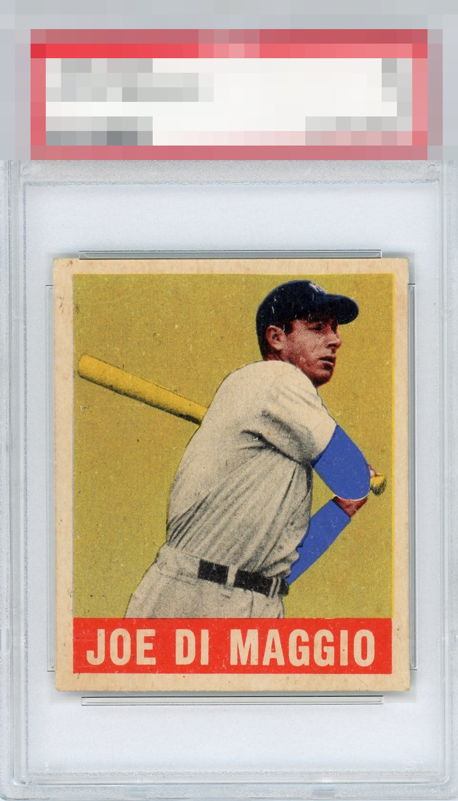
Fan of this copy. High eye appeal. The flaws just don't bother me in any material way. Enough to be an A but no further down to my eye.


Very strong as flaws peek out rather than jump out at me. Centering and focus are both A+ to me.

Centering is good with a slight tilt. Surface issues including the white marks on his hat keep this just below A tier.

Surface wear, primarily around his face, draws my eye, along with a subtle centering shift. Eye appeal is still strong enough for a solid B for me.

Great centering and overall strong eye appeal. Some specks and worn corner leave some slight room for improvement.

This card sits right in my strike zone. Centering is A+. Focus/registration, A+. I am so far from a corner guy so these corners for me are still top echelon of badges. Surface print issues are the lone flaw I notice. Great card.

Very well-centered with a subtle tilt. Surface specks on the face and cap are the glaring issues.

Always enjoyed this card. Love the colors and the contrast of them especially the with the blue as the only bright color. The card overall looks good when you look close you would see some minor stains and marks and the card is off center But everything blends in to make a nice card to enjoy
EyeQ+
EYEQ+ TROPHY CASE


Rating Distribution
13 total reviews
This example comfortably reaches the Top Tier of eye appeal, though I do detect wear. Its condition issues matter some, but not enough to keep my cycloptic eye from remaining fixed primarily on the focused image rather than the low-volume distractions.