1938 Goudey Joe Dimaggio #250

Reviews & Discussions
10 total reviews

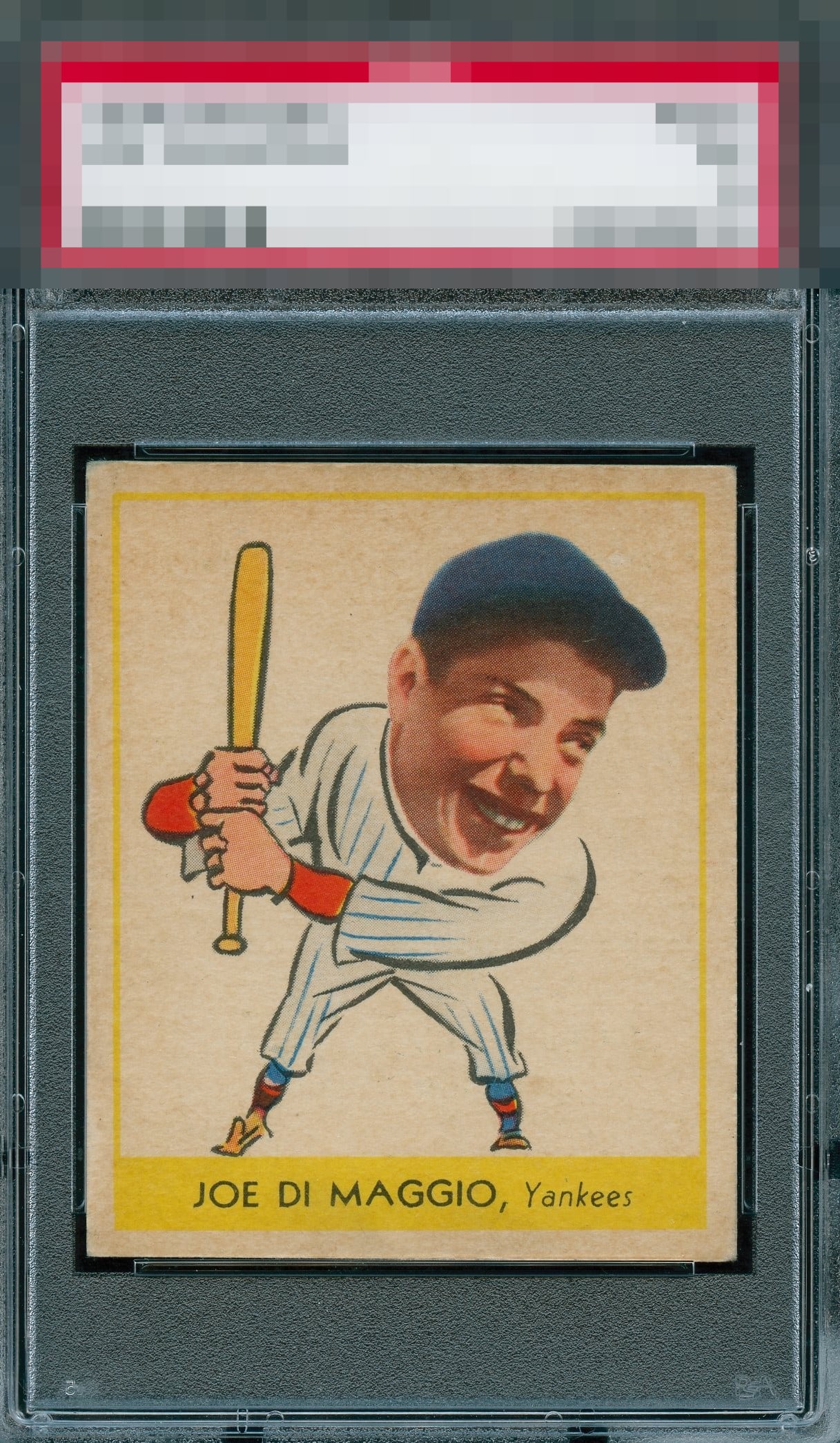
Awesome. Slight tilt. And it must have been the card stock Goudey used that makes almost all examples look slightly mealy. But man. Look at those red sleeves pop!

What a card. I dream of coming across cards like this at a show. No idea how they graded that surface toning but it does not irk me.

This has one and only one flaw I care about and that is surface dirt or toning. That prevents God Tier status, but that's the extent of the impact of that flaw on eye appeal. Love this example!

Centering is great and the card is quite nice overall. The upper area of his face and hat looks a bit blurry to me, but I really love this card.

Great looking card. Nothing jumps out that could make me say this is B-tier eye appeal.

This card really works for me; the wear of time does not present in any extreme way that distracts my eye. Mild overall toning prevents A+ but that is it for me. Great looking example.

A very clean blemish free example. A slight tilt but such a beautiful card.

Very nice looking card and the image is very sharp. There is a slight tilt and also the coloring is nice but I have seen the colors brighter on other cards. Nice card to have

I'm looking for a similar copy of this card. The slight tilt takes it out of god tier but an excellent example.

EyeQ+
EYEQ+ TROPHY CASE


Rating Distribution
10 total reviews
Nice image. Centering is good with a bit of a tilt. Minor corner and surface wear but looks good overall.