1968 Topps Johnny Bench #247
1 / 2

💬
Reviews & Discussions
11 total reviews

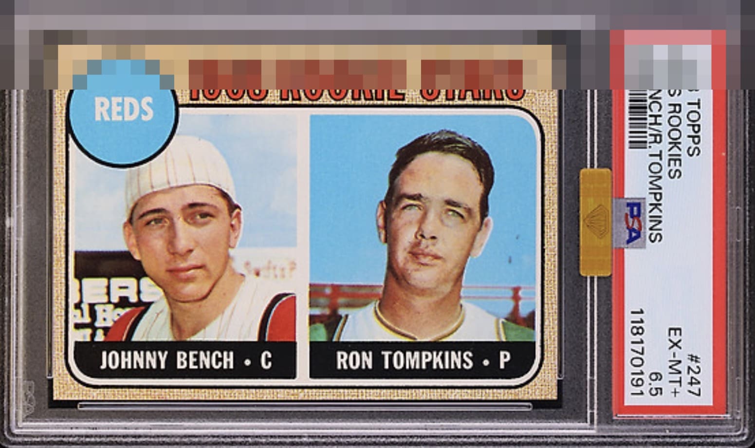
A stunning example, at first glance this was GT but I think TB centering hold this back from that level


TPG 6.5 is wild. L to R centering on back keeps it from GT status. I'd probably send to SGC for a 2nd opinion. Looks like Tommy tough nuts was grading this one.


So sharp. Low centering is the one issue that does jump out at the eye.

Bottom border looks a little thin for my eye. Corners are razor sharp and no PDs spotted. Great copy!

Aside from centering I don't see any issue. Color, images, focus look great.


Great looking card and love how clean the panel porters look. But of a centering opportunity but on a horizontal card not noticeable Just sit back and enjoy this card as I certainly do
10 reviews
1 review
EyeQ+
120.0
Global Population
5
POPULATION ACROSS ALL GRADES AND GRADING COMPANIES
Global Eye Rank
#4
Population in Grade
1
POPULATION IN THIS GRADE ACROSS ALL GRADING COMPANIES
Eye Rank in Grade
#1
EYEQ+ TROPHY CASE

4th Place
GLOBAL

1st Place
IN-GRADE
📊
Rating Distribution
11 total reviews
G
1 rating
10%
1
A+
3 ratings
30%
3
A
1 rating
10%
1
A-
3 ratings
30%
3
B+
2 ratings
20%
2
B
0%
B-
0%
C+
0%
C
0%
C-
0%
D+
0%
D
0%
D-
0%
F
0%
A deceptively tough issue that rarely presents cleanly. This copy threads the needle: the usual print specks and light fade are present, yet the image still carries real vibrancy and the registration holds together under scrutiny. Centering, notoriously unforgiving on this card, lands in that sweet spot where your eye relaxes rather than negotiates. Corners and edges read crisp, the surface retains honest gloss, and the overall composition feels cohesive rather than compromised. Not quite God Tier because of the slight off centering, but it absolutely earns an A+ for eye appeal.