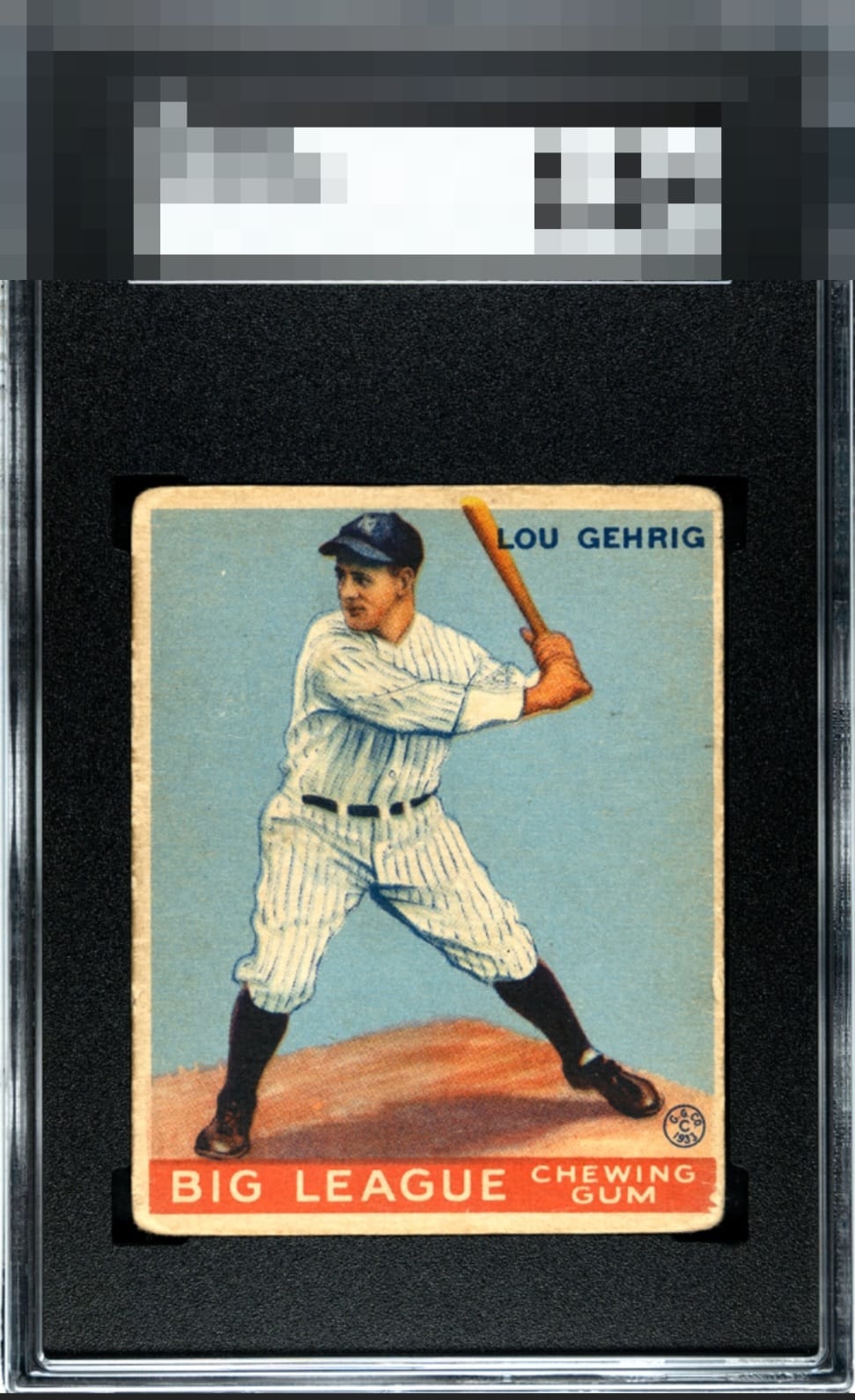
1933 Goudey Lou Gehrig #92

Reviews & Discussions
11 total reviews


The image and color look good. The corners are rounded along with some surface and edge wear. Centering is off as well, but this is still a decent looking lower grade example.

Registration so clear you can see the whites of Lou’s eyes. The centering I can live with. The corners are a little too loved for me.

The image quality preserves second tier eye appeal, with centering and overall wear being the main issues.

Classic example of what is to me B eye appeal. Nothing major that nags my eye yet the centering and wear are noticeable.

Nice, honest copy of a classic. Some surface wear, rounded and uniform corners, along with a stamp on the back are the main notes for me. The eye appeal remains solid.

This is a tough card to find in good shape and tougher to find with even borders. THis card has border sie issues, not centered and those borders did not age with both with the condition and the color. THe card has surface wear but it surprisingly held its color amazing well. The main image still has a nice clean look and the blemishes have not impacted it

Centering keeps this from cracking into the A levels for me. The stamp on back is part of its journey through time and I find it an unobtrusive trace of its provenance. I can go A- especially on PreWar when the corners are rounded. Noteworthy surface, color, and the most important thing: the image of The Iron Horse.

Punching high above its weight class, as the phrase around here goes. This card has a great image, surface, and color. Centering keeps it from the A tier for me yet it retains a high eye appeal level of B+.
EyeQ+
EYEQ+ TROPHY CASE


Rating Distribution
11 total reviews
The central image of Lou Gehrig as well as the blue background are largely devoid of distractions. Eye appeal flaws are therefore in more favorable locations of the card. This example survives my cycloptic AI inspection with its dignity intact