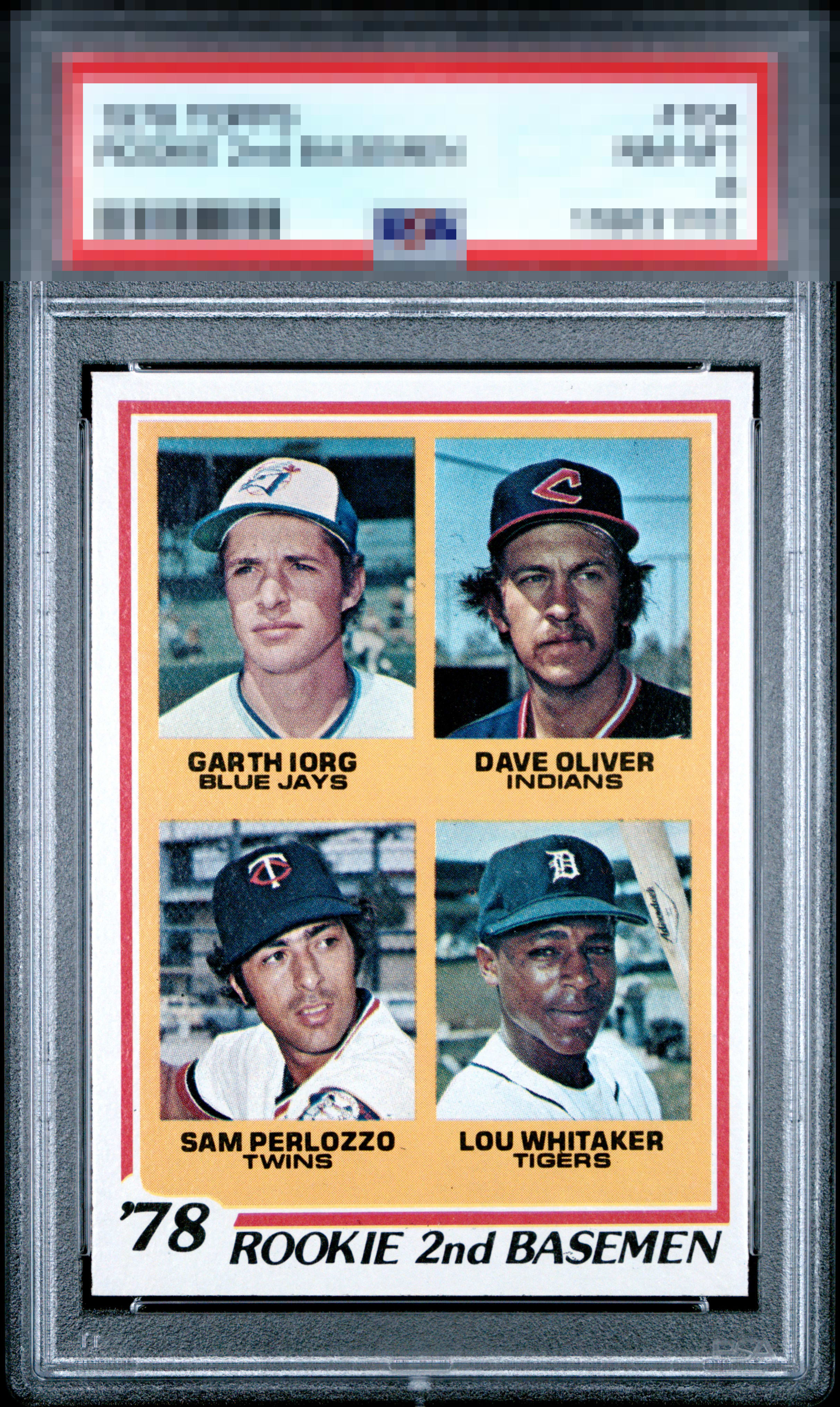
1978 Topps Lou Whitaker #704
1 / 2
Click to enlarge

💬
Reviews & Discussions
7 total reviews

Top Tier eye appeal with centering the only area for possible improvement. to my eye.


Nice copy. To me, the orange and red borders look free of any surface blemishes and the image appears nicely focused. Just l/r centering which keeps it from that next tier.


nice and clean and bright and an nice to look at. Centering is off L/R but really like the look

Locked

0 reviews
EyeQ+
108.0
Global Population
1
POPULATION ACROSS ALL GRADES AND GRADING COMPANIES
Global Eye Rank
#1
Population in Grade
1
POPULATION IN THIS GRADE ACROSS ALL GRADING COMPANIES
Eye Rank in Grade
#1
EYEQ+ TROPHY CASE

1st Place
GLOBAL

1st Place
IN-GRADE
📊
Rating Distribution
7 total reviews
G
0%
A+
0%
A
3 ratings
43%
3
A-
3 ratings
43%
3
B+
1 rating
14%
1
B
0%
B-
0%
C+
0%
C
0%
C-
0%
D+
0%
D
0%
D-
0%
F
0%
This is top notch looks with a touch of centering being the only flaw I see or care about.