1985 Topps Mark Mcgwire #401
1 / 2

💬
Reviews & Discussions
6 total reviews

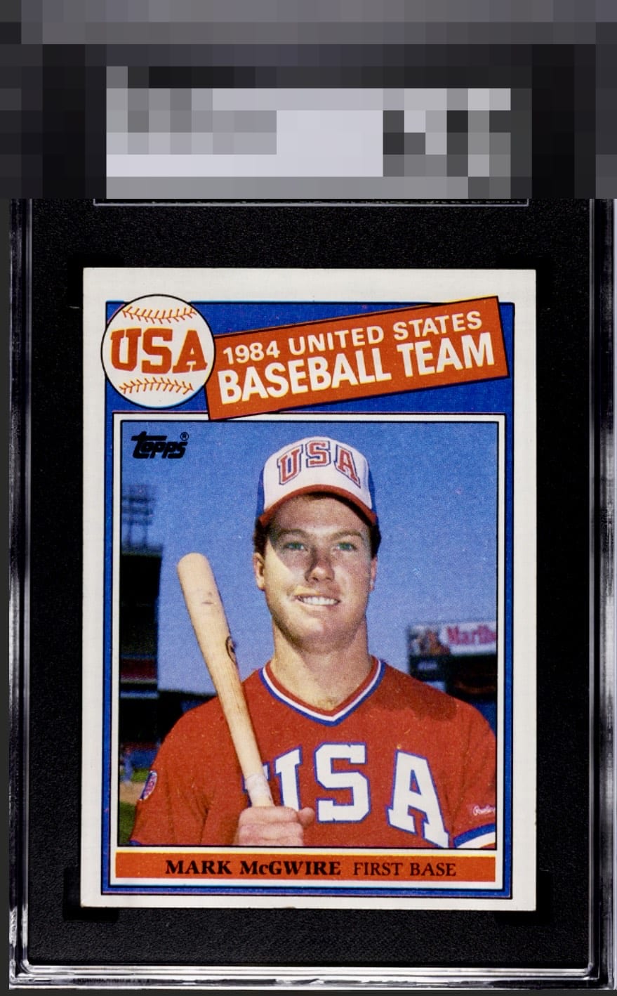
Centering and tilt caught my eye off the bat. The rest of the presentation is solid.


I love when this card has the color that this one exhibits, yet the centering being so low also brings the eye right to the one spot of edge wear in the center of the bottom edge, which does adversely affect the eye appeal.

The borders bother my eyes. 4 Different sizes plus a tilt and it makes the card look off. The colors and image and brightness of the card is good but the Centering issues is to much for me and drags the card down
5 reviews
1 review
EyeQ+
--
Global Population
2
POPULATION ACROSS ALL GRADES AND GRADING COMPANIES
Global Eye Rank
—
No Eye Q+ score
Population in Grade
1
POPULATION IN THIS GRADE ACROSS ALL GRADING COMPANIES
Eye Rank in Grade
—
No Eye Q+ score
EYEQ+ TROPHY CASE

GLOBAL

IN-GRADE
Trophies appear here when earned.
📊
Rating Distribution
6 total reviews
G
0%
A+
0%
A
0%
A-
0%
B+
1 rating
20%
1
B
1 rating
20%
1
B-
1 rating
20%
1
C+
2 ratings
40%
2
C
0%
C-
0%
D+
0%
D
0%
D-
0%
F
0%
Color and image are God Tier, centering then takes it down from there. Still lands in B Tier to me.