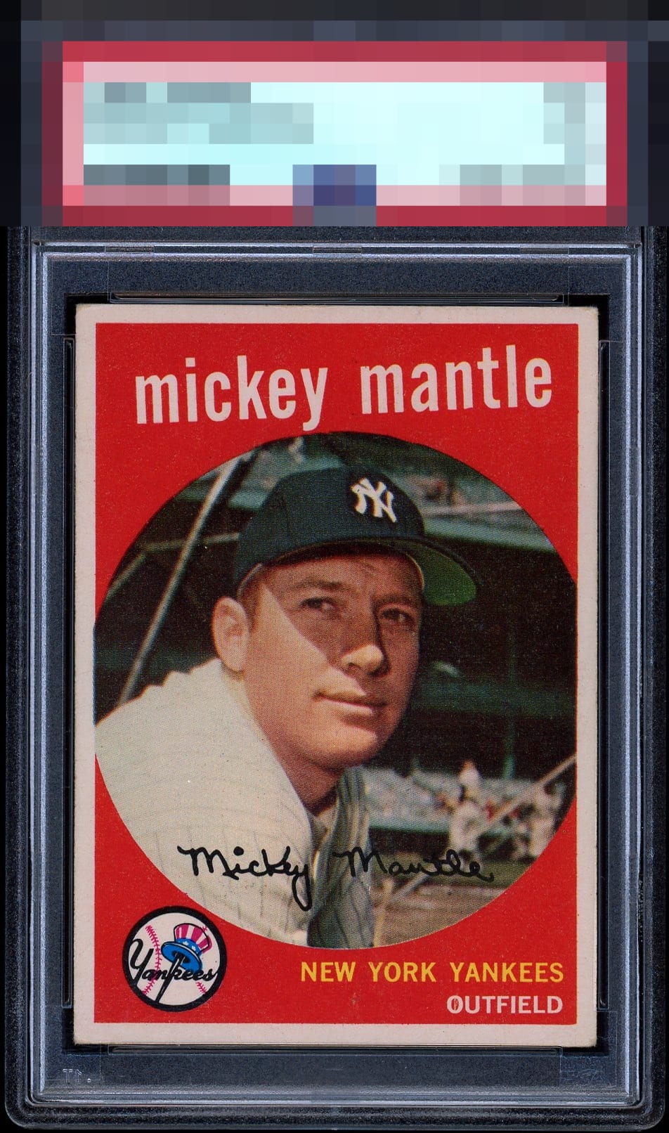
1959 Topps Mickey Mantle #10
Reviews & Discussions
14 total reviews

Center this card down one click of the dial and it would be God Tier for me. Tremendous card.


Wow- this card is dynamite. What colors! The border is perfectly white and has a beautiful contrast with the deep red. Rounded corners keep from a GT.

This is one of the prime "poster child-card" candidates for the sheer concept of Eye Appeal that I enjoy seeing here on this site.


I love this card, perfect in my eyes. The color, registration and centering looks great to me. Hard to find a better PSA 3 than that.

This is off by 1mm top bottom and dead on side to side is my gut call. I see nothing but corner wear on this card. His facial image is weak on some, not this one. Immaculate red.

Pound for pound beast here. Love it when corner wear is the prime issue.

Great looking Card with nice borders minor off centering and slight discoloring from aging. Top left corner wear but that nothing to me
EyeQ+
EYEQ+ TROPHY CASE
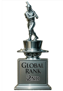

Rating Distribution
14 total reviews
Holy shit that's nice. Not much to complain about here.. The corners aren't 'perfect' and that's about it. Amazing find, whoever owns this.. **Coming back to say it's hilarious seeing this sitting between 8's and 9's in the COMPARE feature!