1959 Topps Mickey Mantle #10

Reviews & Discussions
11 total reviews

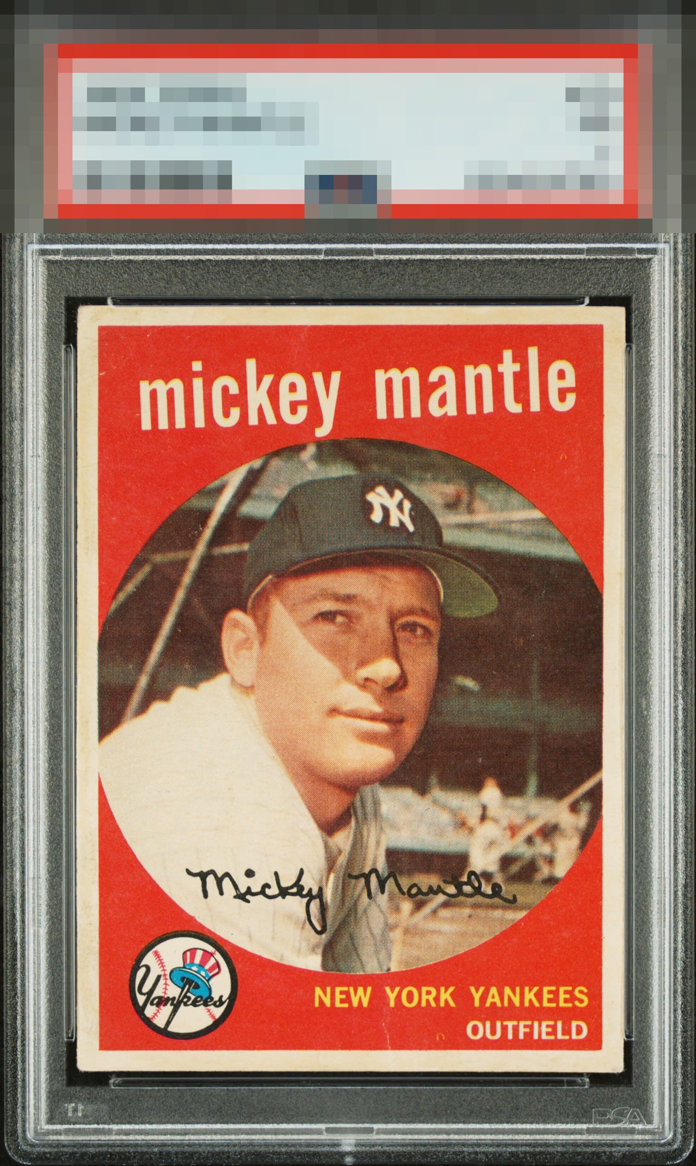
A couple minor issues but nothing too distracting. Centering on this one carries the day.

The presence of technical flaws is noticed, then set nonchalantly aside. Those flaws make only a minor impact on the aesthetic beauty, which pleases both human and artificial cycloptic eyes.


First thing I notice is the strong centering and nice red background. A couple of minor small wrinkles but doesn't really detract.

Love it. Clean and Bright and So Right. That centering is Sweet and the image and colors POP. Held back only by the crease and blemish below the "York Yankees"

Centering is almost perfect, which is tough to find on this card. The color and image look nice too. A couple small creases and some surface wear on the front and paper loss on the back keep this at an A- for me.

A poster card for this site! Talk about flaws not bothering a real actual collector count me as one.

I’ve been drooling over this copy for a solid five minutes. In my opinion, this is a top-tier ’59. I see the back damage and also notice a few tiny surface imperfections. The centering, color, and overall registration are GT for me. I have to knock it down to an A+ based on my minor notes, but this is an incredible copy to me.

I must have owned 50 of these over the years. This is a beauty. Obviously, the centering is special, but I'd also like to draw attention to the image focus; it's surprising how many are a little blurry. Using COMPARE will reveal this for sure. I also look for a solid red on this card, with ideally no print dots; I see a faint one left of OUTFIELD and some pinpoint white elsewhere but the latter does not hold my attention so does not factor in. Where I kind of march to my own drum is regarding the back damage; this does not faze me. I would hardly ever notice it. The truth is I would upgrade my 6 to this example;my eye would never know the difference; only my wallet would.
EyeQ+

EYEQ+ TROPHY CASE


Rating Distribution
11 total reviews
can i swear on this site? holy f...