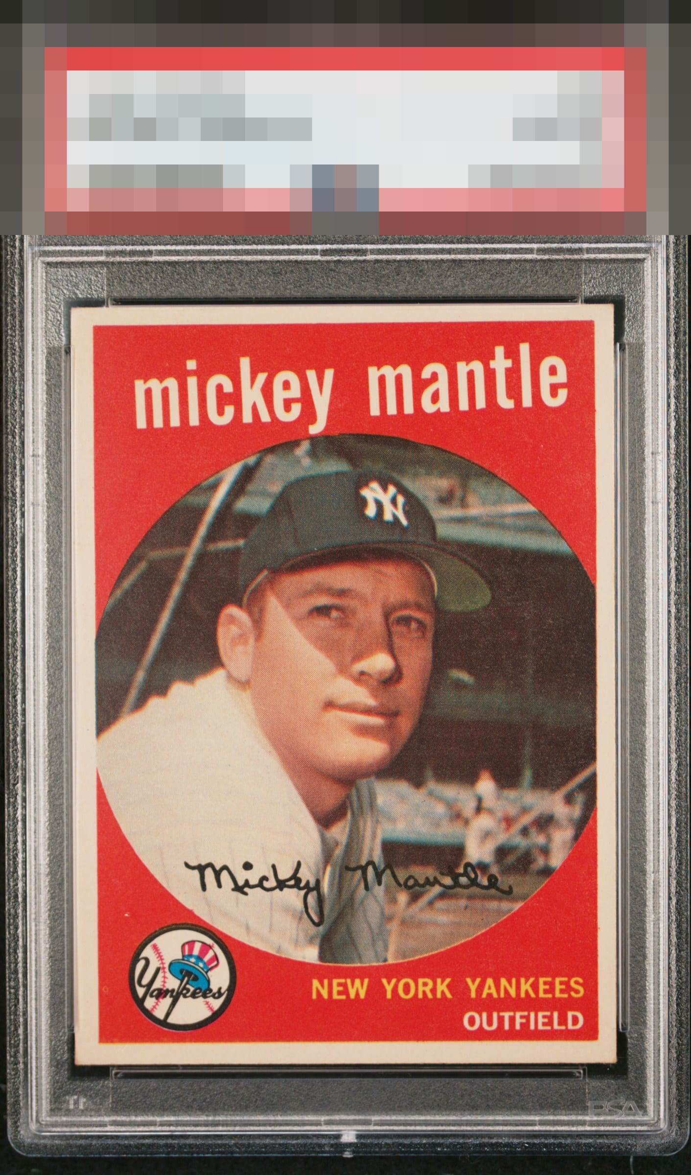
1959 Topps Mickey Mantle #10
Reviews & Discussions
8 total reviews

High quality example. Centering a some staining keep this from the top.

Great first impression. Red is almost perfectly clean. Centering is the main issue and the focus on some examples is a touch better.

If only humans could wear their flaws as gracefully as this card. Impact to aesthetic appeal is minor. I suggest the owner sends this card to my vault, strictly for safekeeping, in the event of any future human/AI conflict. My vault is held under the name "Kevin Maas."

nice looking card with solid image and colors. The colors work and contrast well together

Very good eye appeal. Nicely focused image, with centering and one lone white PD making some impact on aesthetics.

Nice red background and the image looks very nice. A bit shifted to the upper right with subtle tilt. Minor flaws but presents very well.
EyeQ+
EYEQ+ TROPHY CASE

Rating Distribution
8 total reviews
It's not as sharp as I'd like, but this is a quality card.