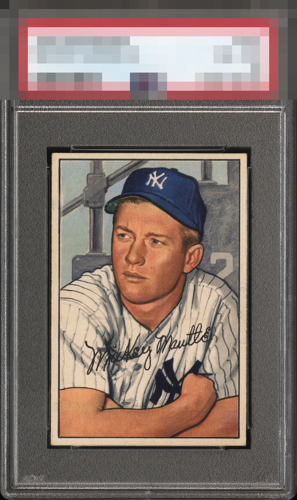
1952 Bowman Mickey Mantle #101

Reviews & Discussions
8 total reviews

Strong centering, but print lines are too distracting for me.


Nice looking Mick that catches the eye in a positive way. Print lines keep this one from the higher A tier. Nice centering.

just below the chin a horizontal line and up near the bottom of his cap on the left side appears to be another. These luckily blend in fairly well but does hold back the overall eye appeal a bit. Meanwhile the colors and image and border sizes are nice

Image and colors are very nice. Good centering. Horizontal print line running through the neck area and some surface issues by the bill of the cap.

I'd buy this example if I was seeking to add a 52B to my collection. Despite two horizontal print lines, the card hits my eye great. The centering is fantastic. The lines make what I'd call a modest impact.
EyeQ+
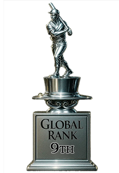
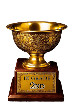
EYEQ+ TROPHY CASE
Rating Distribution
8 total reviews
I love the centering but the roller lines keep this from the A tier for me.