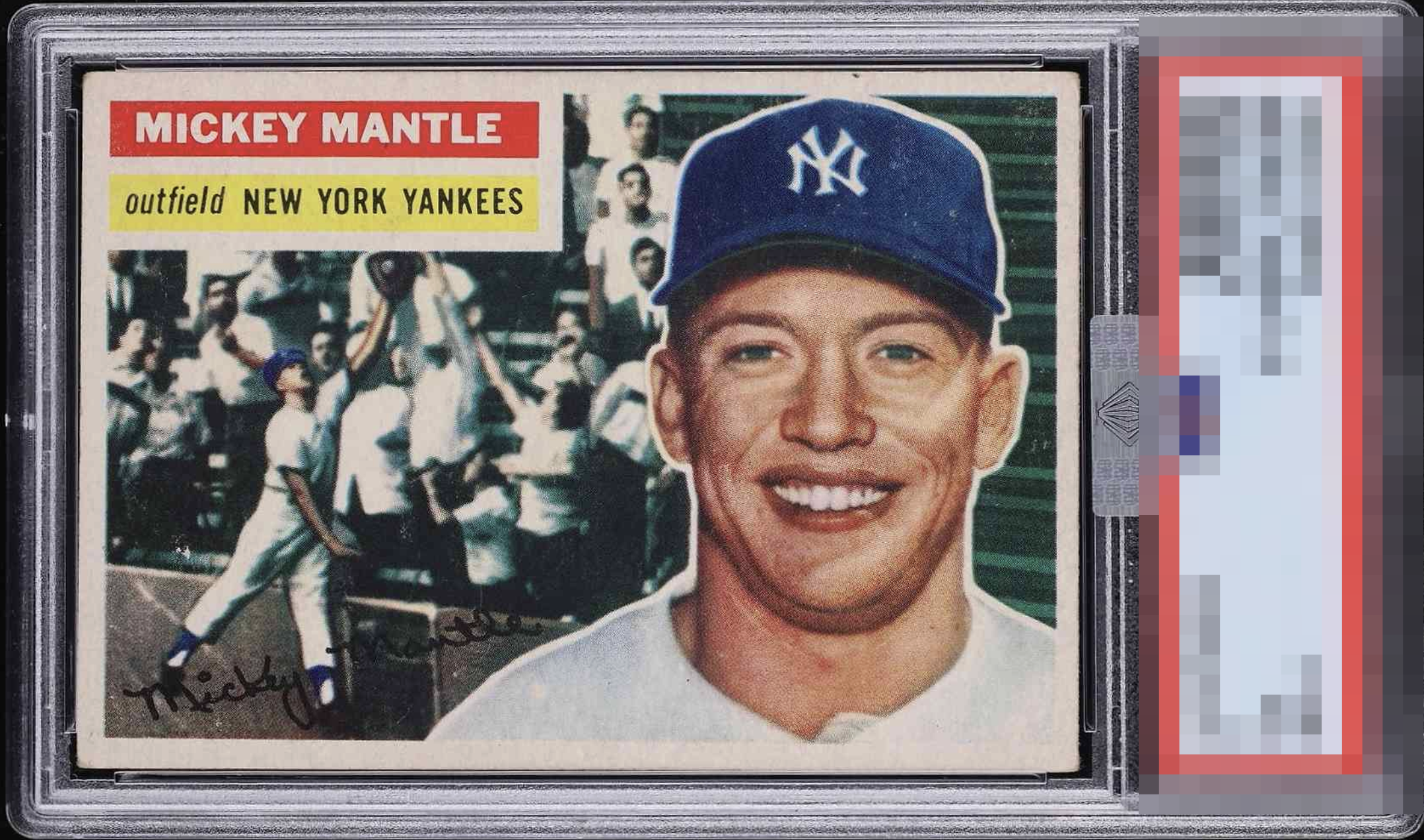
1956 Topps Mickey Mantle #135

Reviews & Discussions
10 total reviews

The blemished on the cap are the only thing that really stand out. Sure it can be a touch better centered but overall this card just pops. Everything is clicking for me.

Surface and corners aren't perfect, but this is a good looking '56 Mantle. Definitely display worthy.

Strong eye appeal, falls shy of the top rung of badges due to some surface snow that's prevalent on his cap, and centering.

Attractive centering. Touched corners & a bit of surface wear keep it from the A tier but still a strong example of this card.


Nice color and image. Centering is a little off left to right but better than most. Surface wear seems confined mostly to the upper right and doesn't distract much. Great looking overall.

Sometimes eye appeal is as simple as feeling your knee-jerk reflex at first sight. This card has 'it.' A tick better centering or less wear from even higher eye appeal.

First Glance the card looks nice Second Glance the same Has minor surface wear and discoloring on the border near the main image but overall nice centering strong image and strong colors Would be proud to own it

Reasonably well-centered. Good color and image. Some snow in the background and on the cap.

EyeQ+
EYEQ+ TROPHY CASE

Rating Distribution
10 total reviews
Edges and corners are soft and have some issues but the color and image save it. The beauty is there and is a great card.