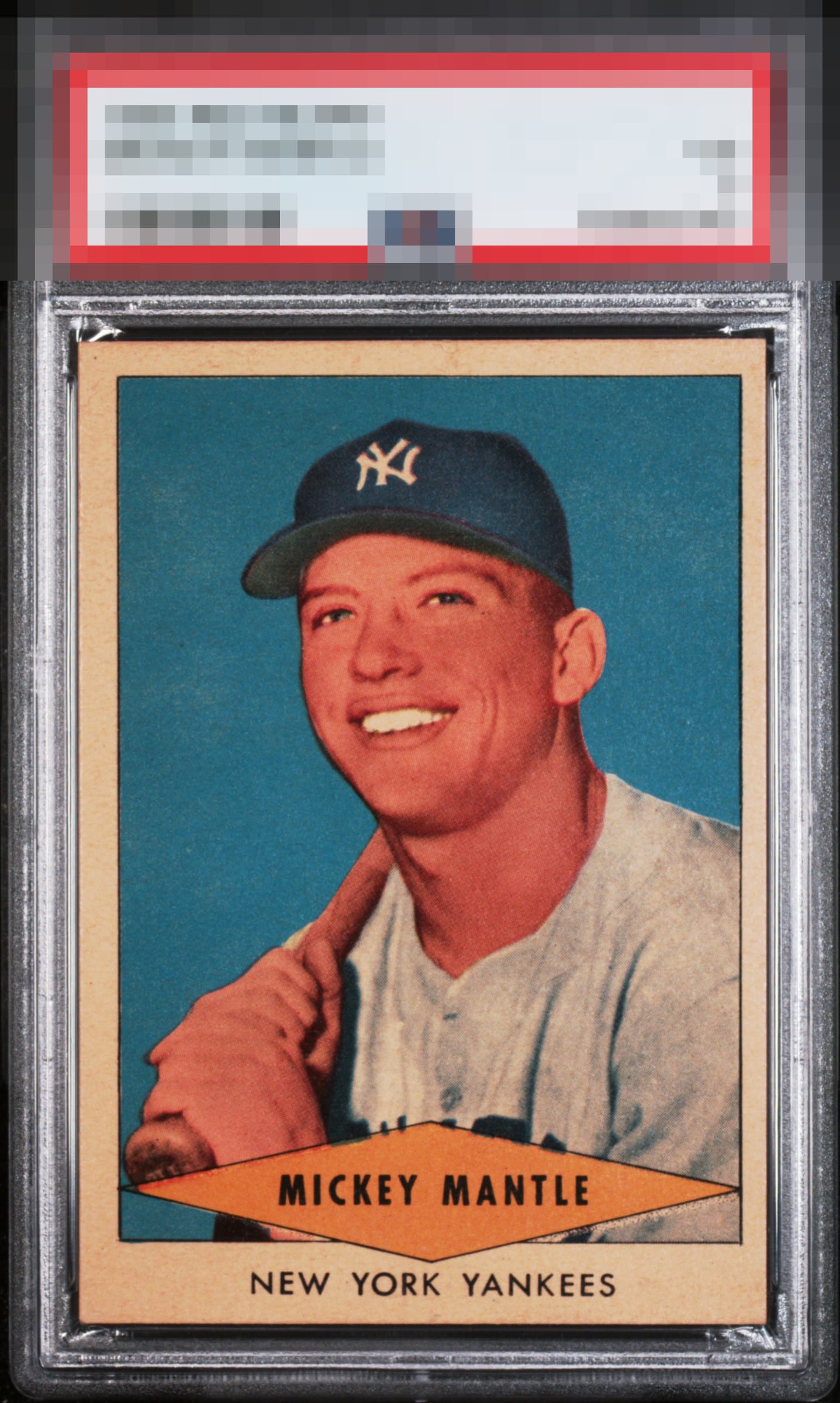
1954 Redheart Mickey Mantle

Reviews & Discussions
11 total reviews


Only the centering hampers the eye appeal on this card. Great focus and color!

Love the deep blue background and the image looks great. Centering and some border toning keep this just below A range for me.

Nice deep colors, but the centering brings the eye appeal into the lower B range for me. That said, still looks nicer than the assigned technical grade.

Normally this centering will cap eye appeal at B+ yet this card, overall, has mojo. The blue and the registration carry it! Paging Lord Slabington! Really pretty.

Great image of the Mick and the colors and registration are excellent. The centering brings it down a few notches for me but no other major flaws. For the collector that isn’t centering obsessed this is a fantastic example.

Very good colors. Blemishes are minor in the background. Main issue is the centering.

Border centering and discoloring of those borders holds back this card. The image and the colors are solid and those corners are pretty sharp as find them usually beat up a bit. But the discoloring more than anything holds it back

Nice colors, surface issues the left of his face and off centering brings down the eye appeal but a great card for the grade.
EyeQ+
EYEQ+ TROPHY CASE


Rating Distribution
11 total reviews
Lovely colour, perfectly registered, I know the Centering is off but my goodness this has to be a top 5% colour example.